POSTUP
DESIGN SPRINT
Summary
Complete a fictional design sprint provided by BytesizeUX.
Duration
5 Days.
Team
Solo queue.
Tools
Bytesize UX, Sketch, Adobe Illustrator, Adobe Photoshop, InVision
Client
Deliverables
THE PROBLEM
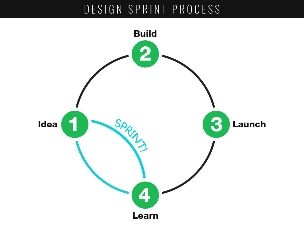
A Google Ventures design sprint is a 5-day process for answering critical business questions through design, as well as prototyping and testing ideas with customers. This project was a modified GV design sprint. A GV design sprint is typically conducted by a team to promote collaboration, but for this project, I conducted it solo. The design brief and research data were provided by Bitesize UX via Springboard UX Career Track course.
DAY 1: RESEARCH
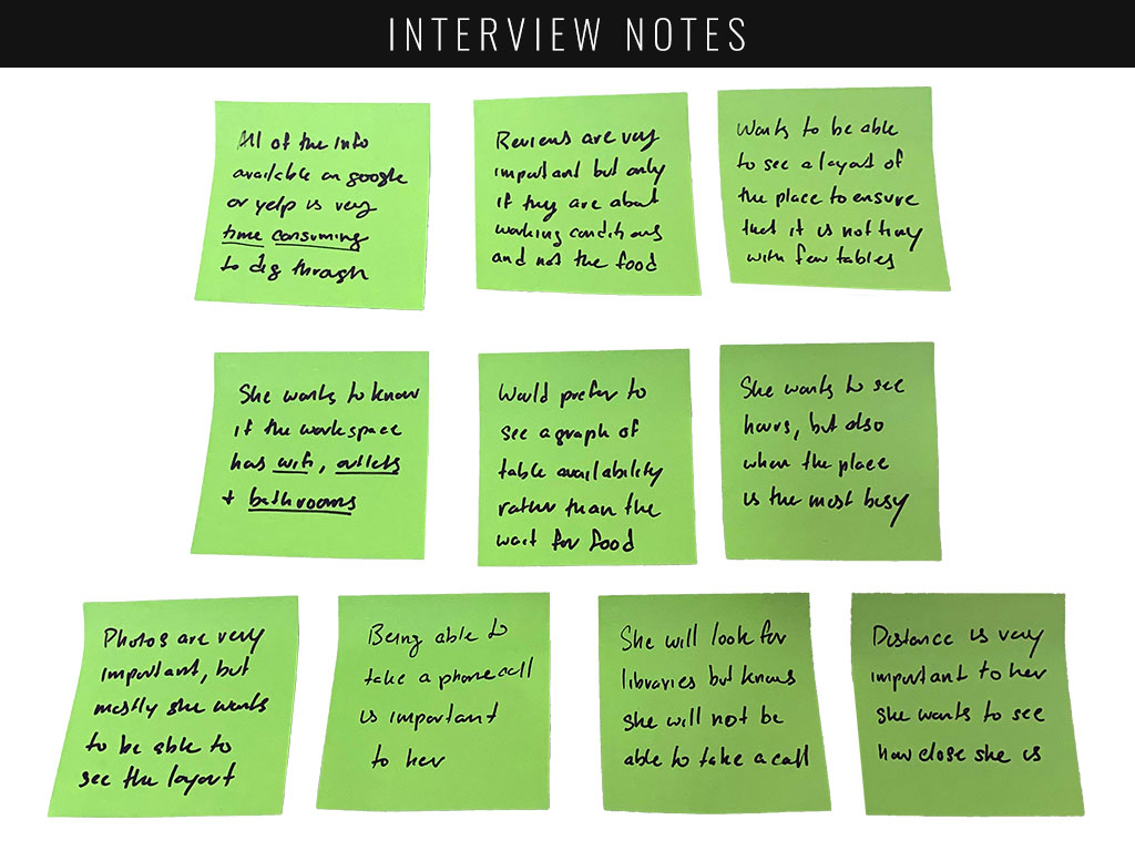
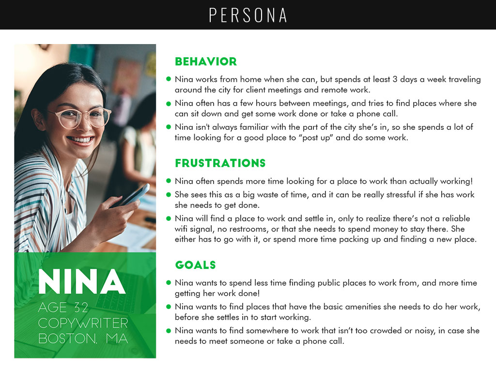
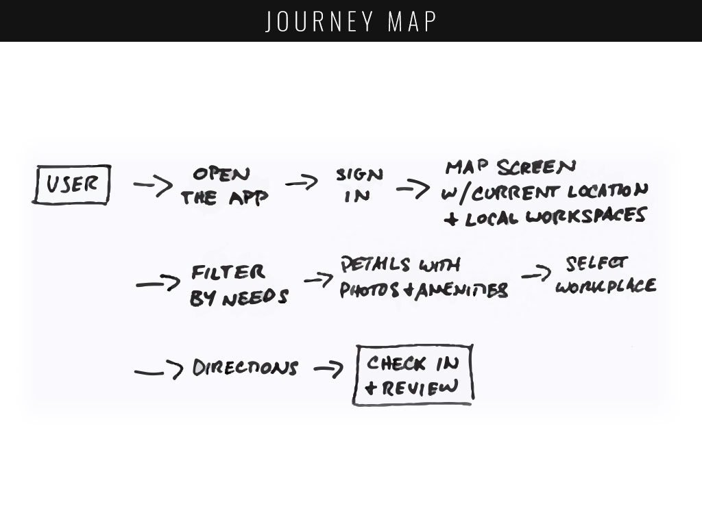
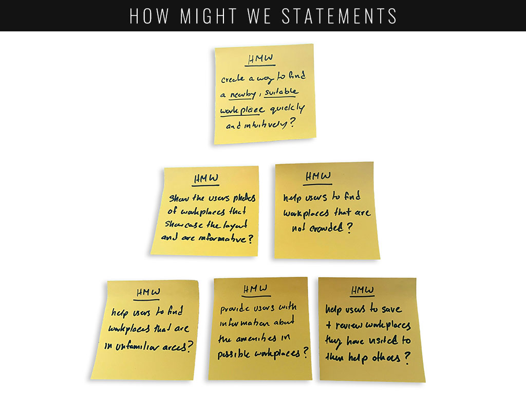
Bytesize UX provided me with a variety of already established research, including a user interview, a survey, and a persona (which I re-created) in order to help me organize pain points, insights and quotes on sticky notes to get a better idea of how PostUp could best serve the users’ needs. The first day wrapped up by drafting How Might We statements and concluding with a potential user journey.
DAY 2: SKETCH
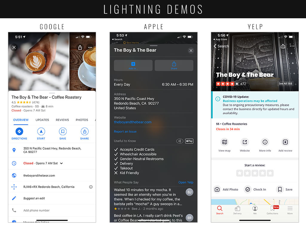
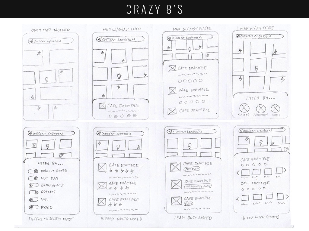
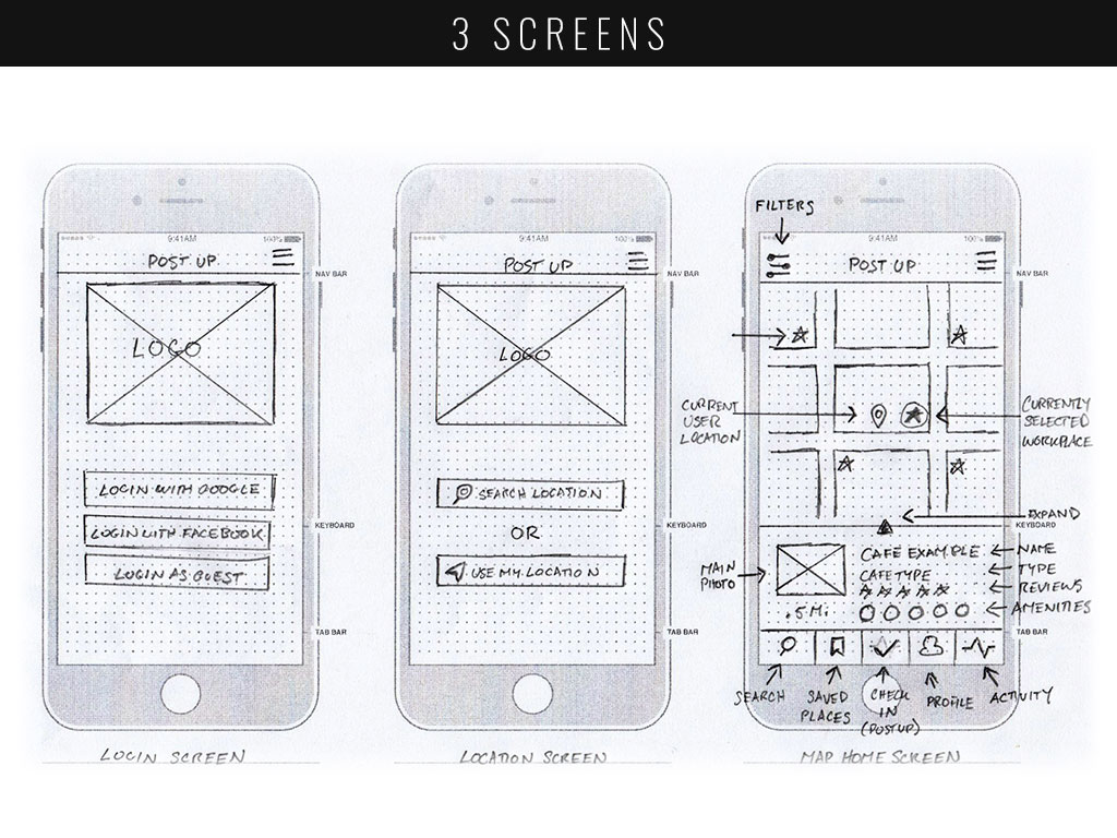
Day 2 began with lightning demos, researching for just 20 minutes some current solutions in the marketplace. With these solutions in my head, I moved right into a Crazy 8’s exercise, creating 8 different versions of my most important screen (the map screen). Day 2 ended with me quickly decided on one of these and sketching two more of the most crucial screens.
DAY 3: DECIDE
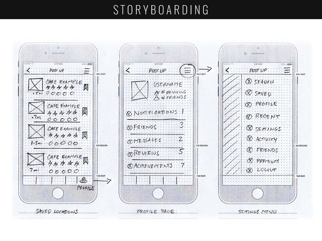
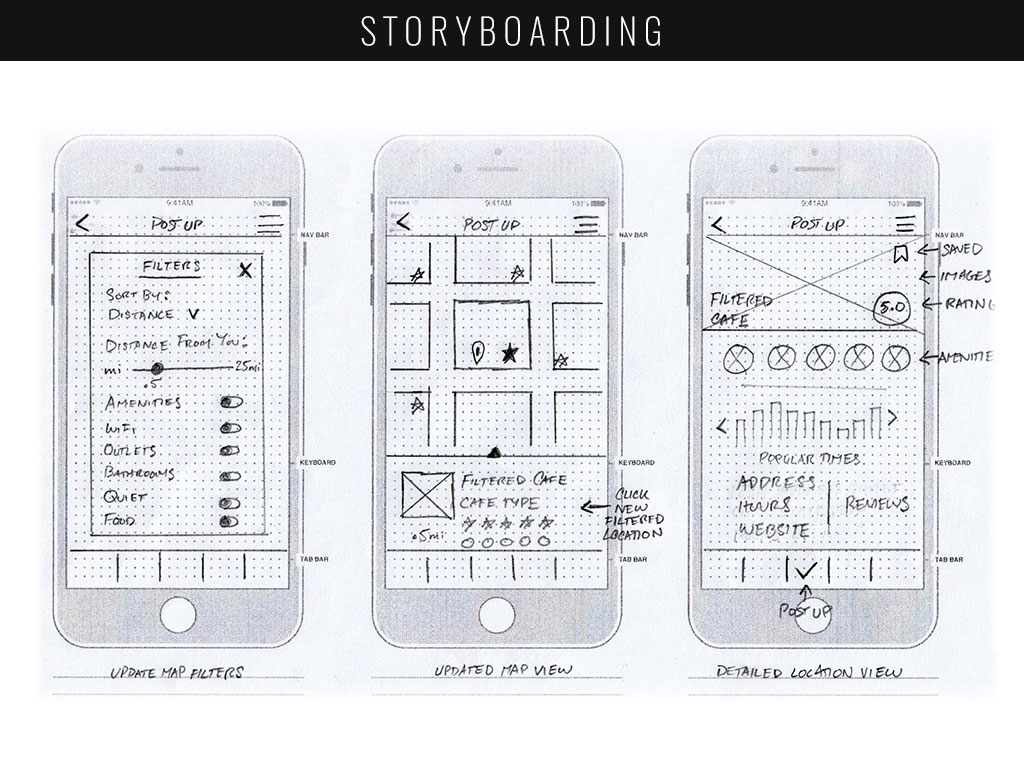
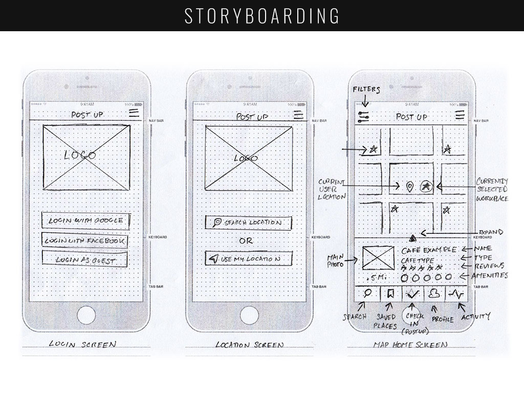
With PostUp’s most important screens completed, on Day 3 I was now ready to sketch out what the rest of the application would look like. Storyboarding helped give me a lightweight, sketched wire frame that would help me build my prototype, helping to make sure every screen had all of the necessary UI elements that would fit within it.
DAY 4: PROTOTYPE
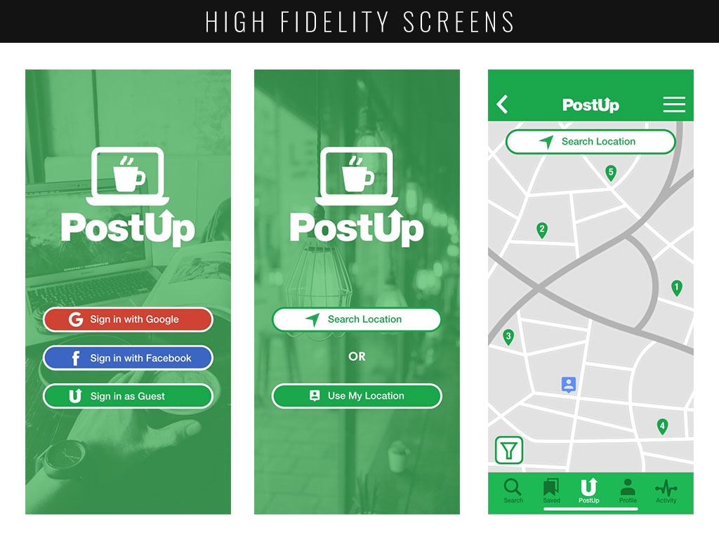
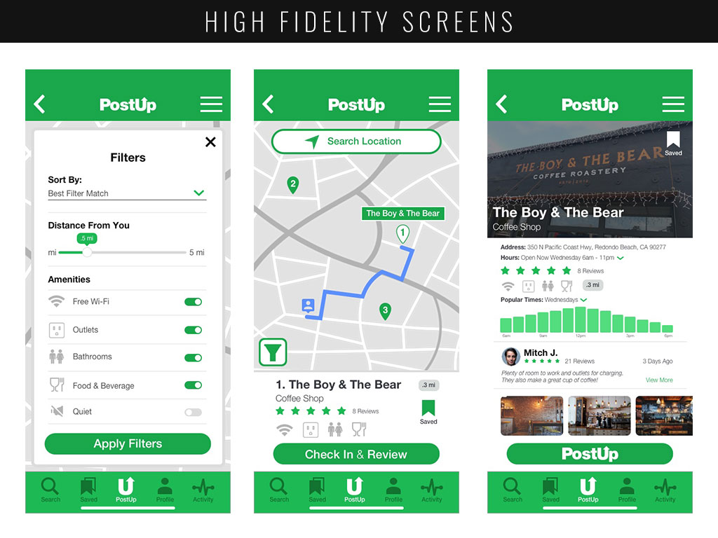
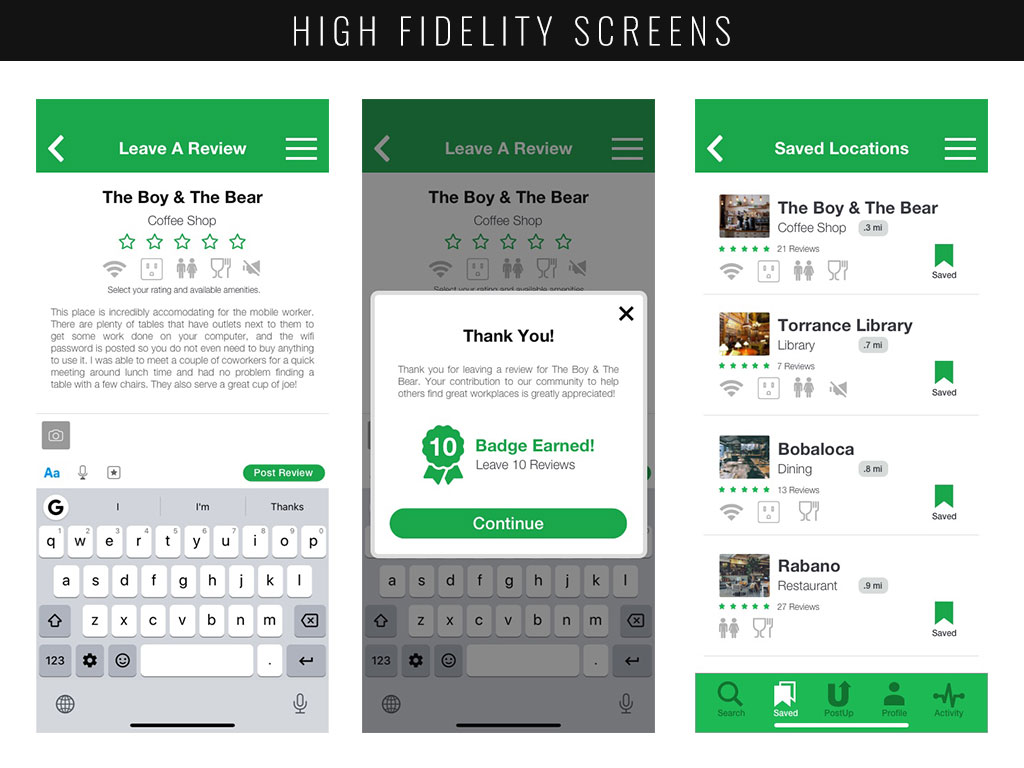
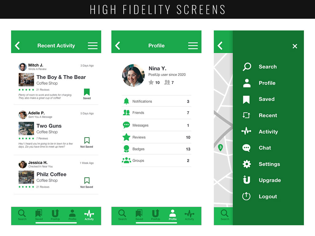
With my informative and detailed sketches in-hand, I was able to move onto prototyping during Day 4. This involved building a working, functional version of my application that I would be able to test during Day 5 with my users. I utilized both Adobe Illustrator and Sketch for this process, allowing me to work quickly and effectively with some pre-built UI kits for added help.
DAY 5: VALIDATE
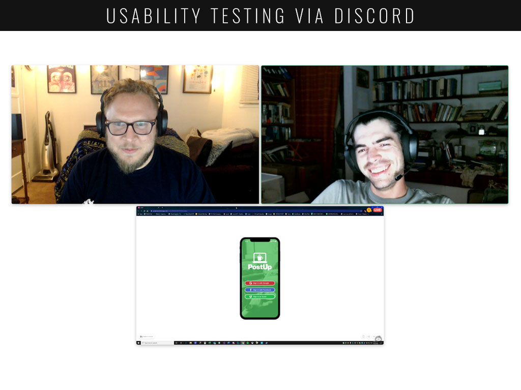
Day 5 was completely reserved for usability testing and interviews with users. During these interviews I asked users to set out to complete a set of three different tasks in order to validate if my design did indeed work for an individual looking for a workplace. Specific quotes regarding pain points followed:
- “I think that the ‘Search’ and ‘PostUp’ options in the bottom menu are a little redundant. They could probably be the same button, to have four items instead of five. Or, a button for another feature I might use frequently like Chat.”
- “It was not immediately apparent to me how I could view my friend’s activity. Even through the Profile menu, it was far too many clicks to get to where I wanted to go. I think that Friends should replace the activity feed, or the activity feed should only be about friends.”
- “The filter button was not immediately apparent to me. I think because the map was already showing a list of pre-filtered locations I presumed that I would be able to simply click “1”, which worked.
Throughout the five interviews, I noticed that almost every single participant struggled on the same few aspects of the design:
- The Filter Button
- Filter button was not immediately apparent
- Users didn’t recognize the filter, and were looking for a different icon
- The map locations were already available, and many skipped over it
- The Friends/Activity Features
- Users couldn’t find a ‘friends’ list
- Users didn’t know what to expect when landing on the Activity page
- Where ‘Friends’ was available in the design, it was not functional
- The Search/PostUp Features
- Search & Post Up seemed redundant
- Search function brought them ‘outside’ of the application, to a screen resembling part of the onboarding process
- ‘PostUp’ used as a colloquialism didn’t make sense when they wanted to navigate
All of the feedback was incredibly informative, and though there were a few outliers there were some definite issues that multiple users pointed out. This gave me a lot of critical insight into where I should focus my attention, were I to move forward, and how I could better serve my users by providing solutions in a more intuitive way.
FINAL THOUGHTS
When designing an app like PostUp, I found the process incredibly useful in the way it helped me find problems very early on in the sprint. From Day 1 I had an extremely clear idea of what the users wanted, what their pain points were and how I might be able to facilitate solutions. And getting answers just four days later was lightning fast!
Overall, my experience with the Design Sprint was a humbling reminder that users are king. I need to be completely cognizant of how the application works for a variety of individuals, and not just myself. This project really took me out of my comfort zone of being able to take my time with my normal routine. But the Design Sprint, in general, was fantastic in showing the ability to provide a solution that does not have to be time consuming.


