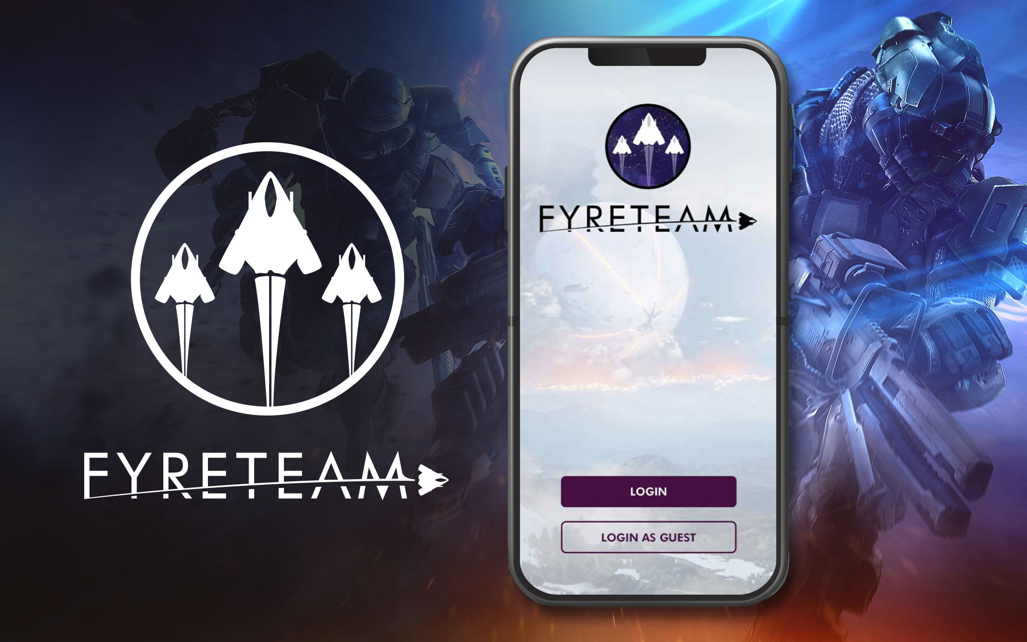
FYRETEAM
UX PROCESS
Summary
A fleshed-out UX process for a Destiny 2 mobile companion application.
Duration
3 Months.
Team
Myself.
Tools
Google Docs, Google Slides, Google Survey, Sketch, Adobe Illustrator, Adobe Photoshop
Client
Student project.
Deliverables
THE PROBLEM
RESEARCH
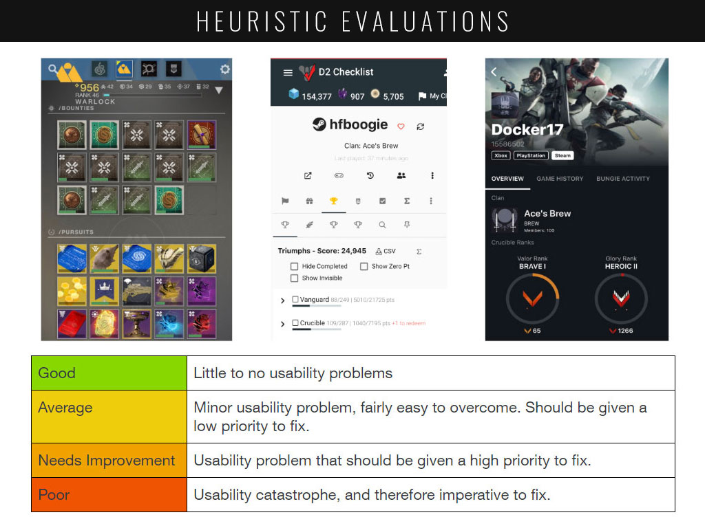
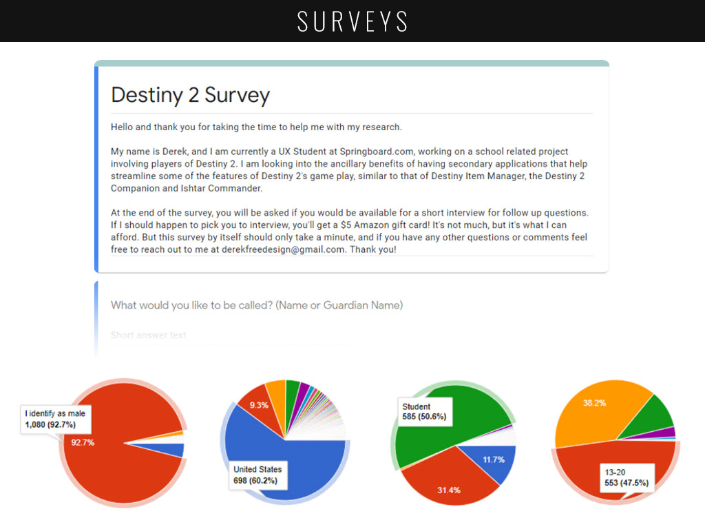
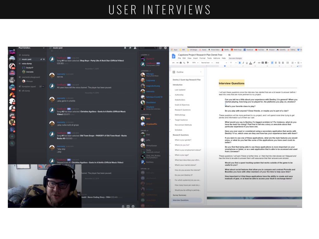
In order to further my evaluation, I created a rating system for evaluating three products using the three heuristics I chose, Consistency and Standards, Aesthetic and Minimalist Design and Flexibility and Efficiency of Use, all taken from the Nielson Norman Group’s 10 Usability Heuristics for User Interface Design. I also conducted a survey using Google in order to establish a baseline of my users. I then concluded this section of my process with interviews with some of the individuals who submitted responses, hoping to answer a few key questions:
- What demographics does Destiny 2 cater to; who are Destiny 2’s players?
- Do these users utilize secondary applications outside of Destiny 2?
- What features are missing from current solutions?
USERS
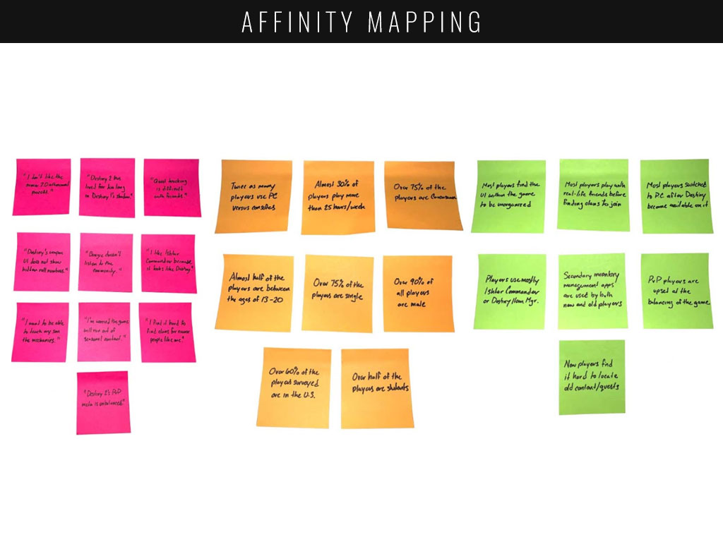
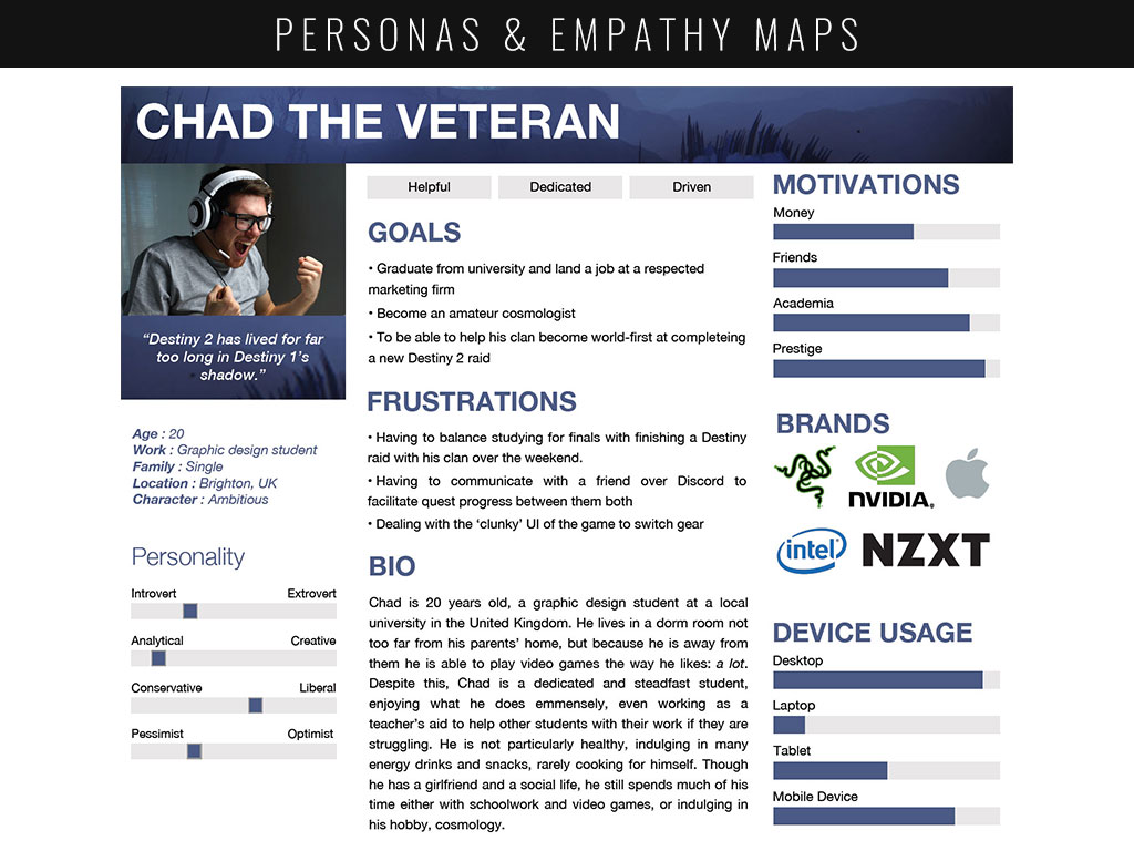
In order to better understand my users, I created personas and empathy maps based on two main archetypes of players: veterans and rookies. This process helped to further synthesize my research, allowing me to zero in on pain points for both types of players. Utilizing all of my research, I developed a few core questions I wished to apply moving forward when developing the features of Fyreteam:
- How might we provide players with effective social systems?
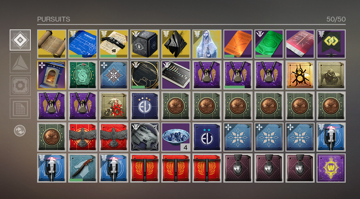
- How might we improve upon Destiny 2’s quest and inventory systems?
- How might we emulates Destiny 2’s look and feel?
INFORMATION ARCHITECTURE
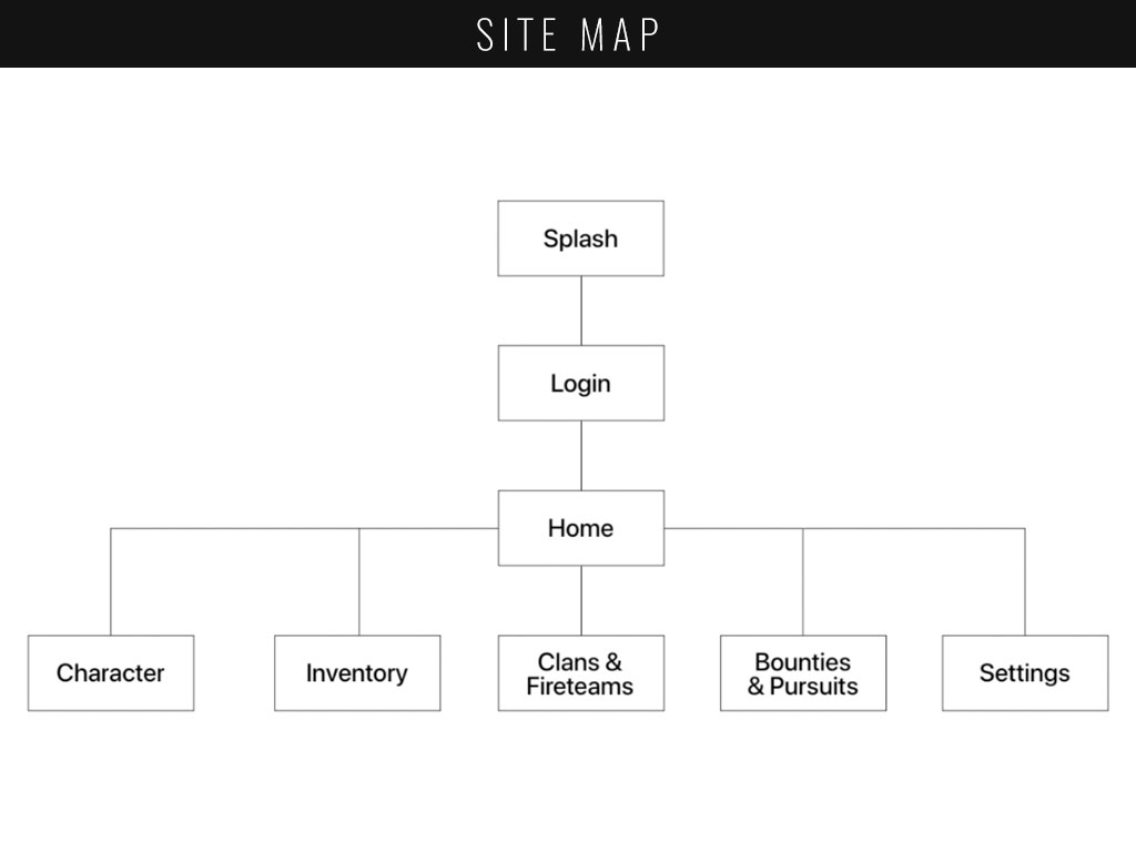
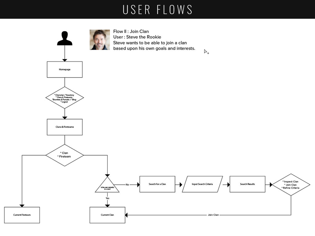
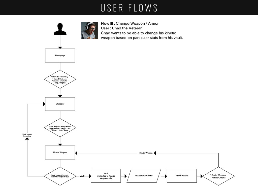
In order to organize all of my thoughts and research I needed to create a list of simple statements of the various tasks my users would want to do within my application. These tasks would act as direct and indirect answers to my “how might we” statements. This would then pave the way to my MVP features, allowing me to create a site map and user flows to showcase how a user might accomplish each task.
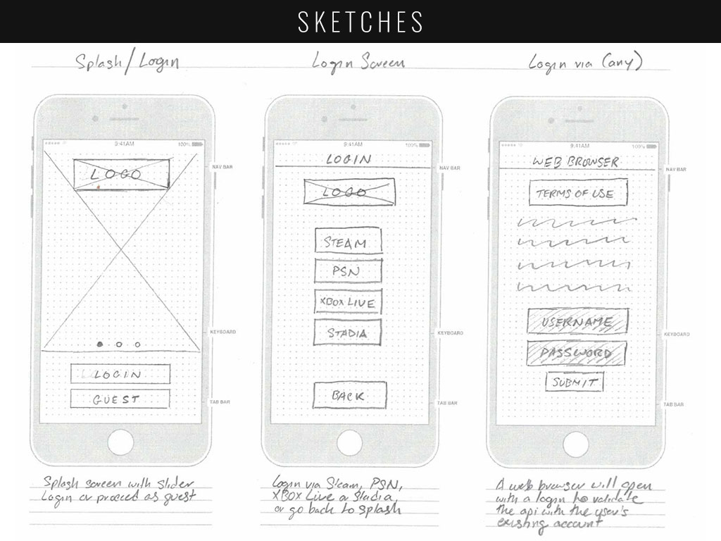
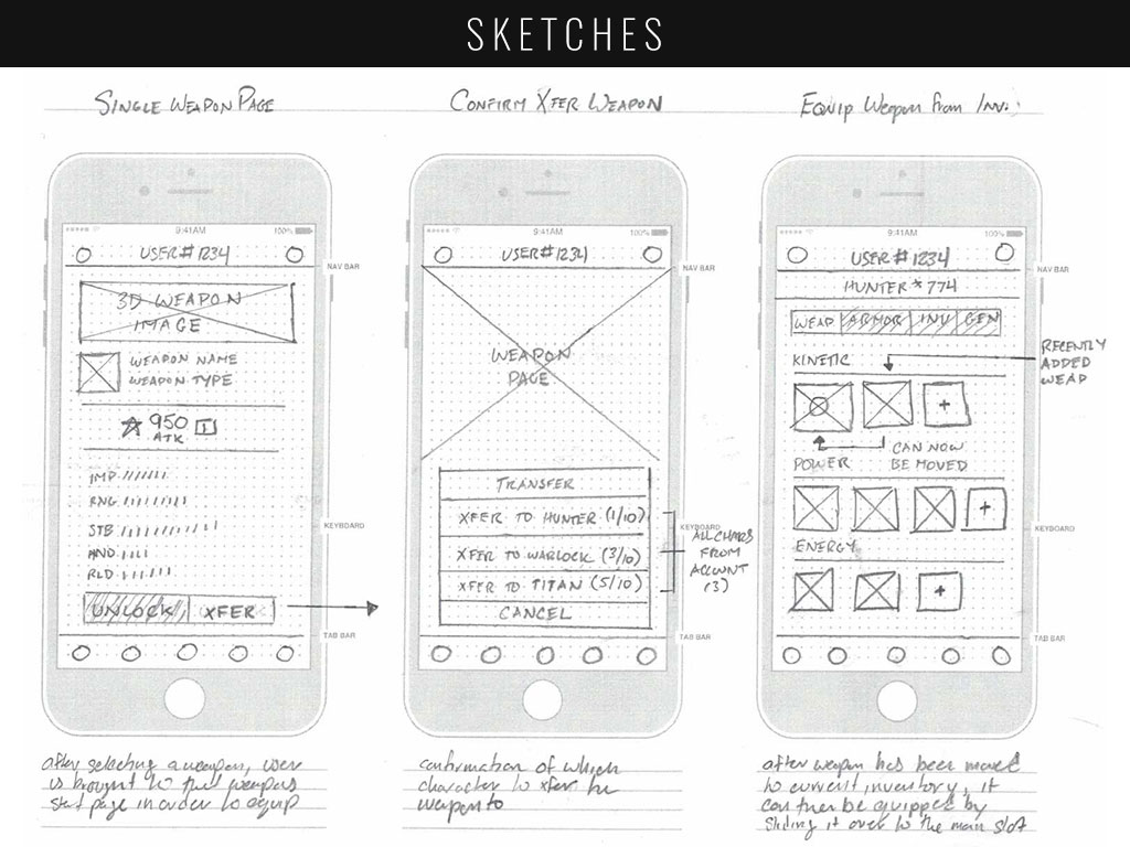
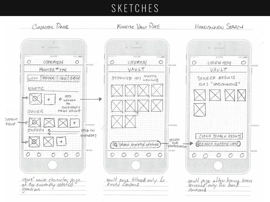
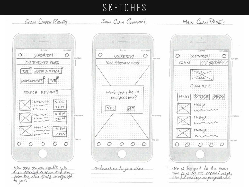
SKETCHES & WIRE FRAMING
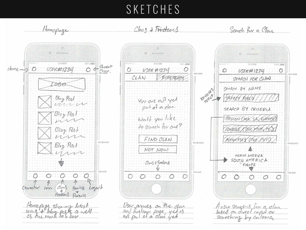
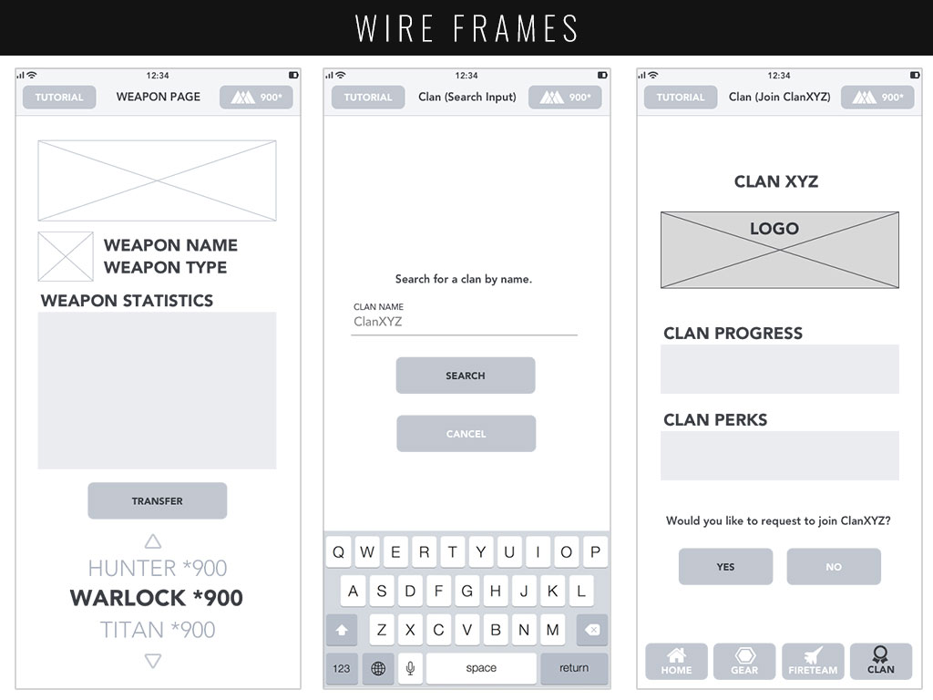
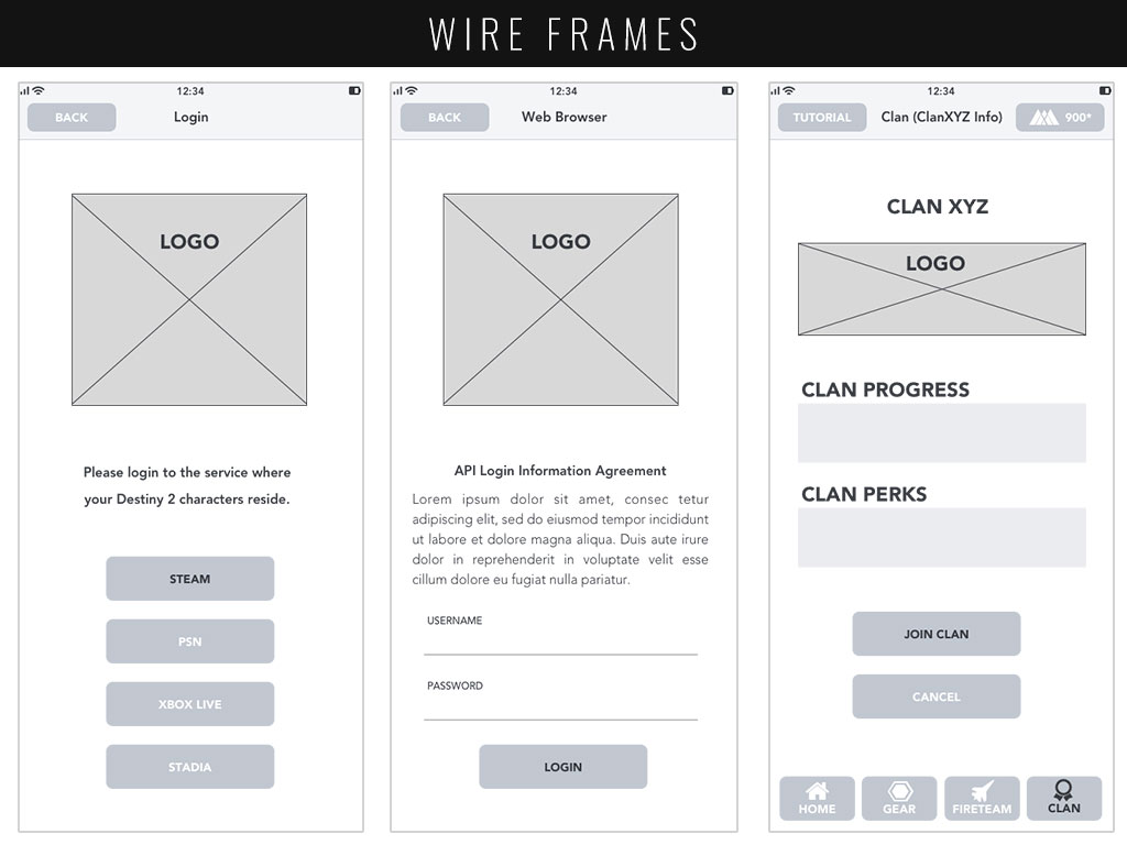
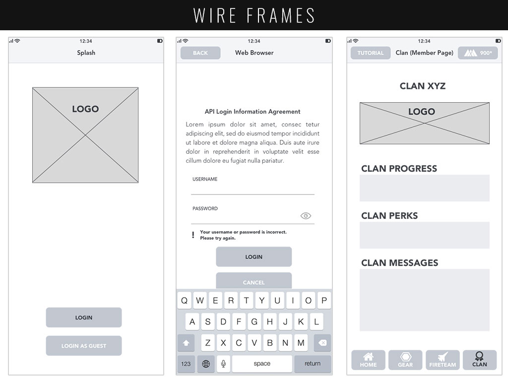
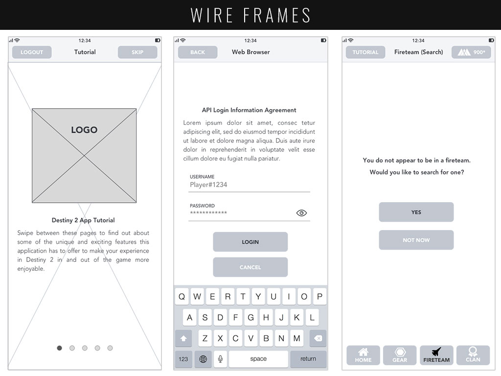
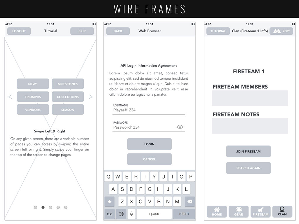
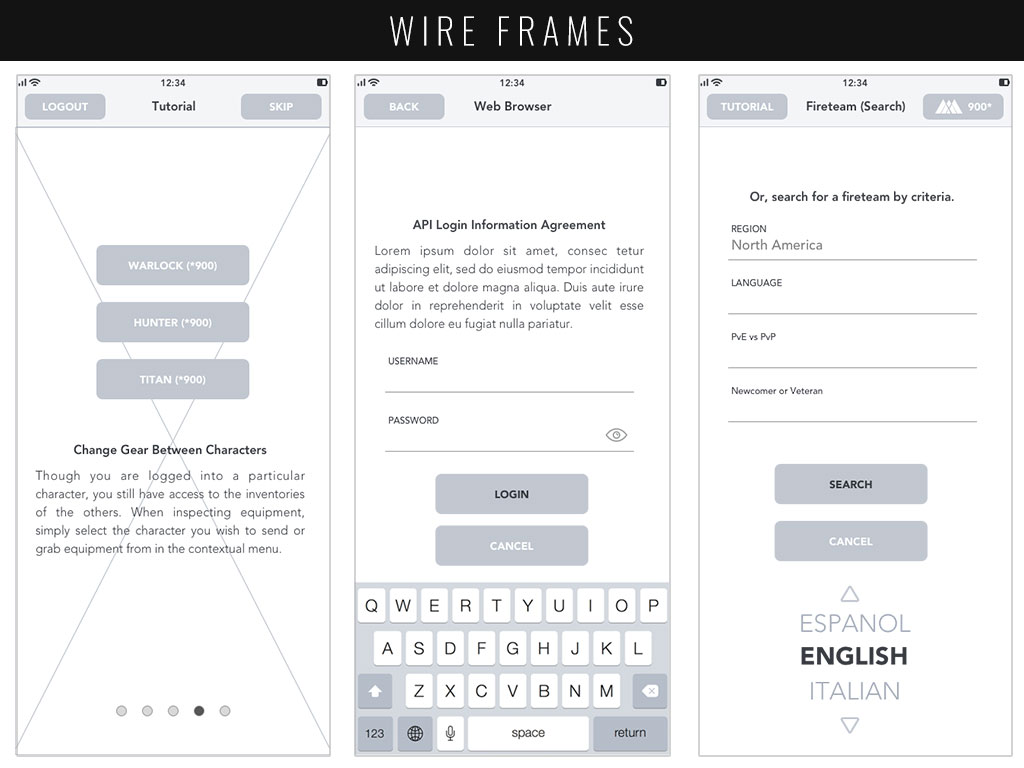
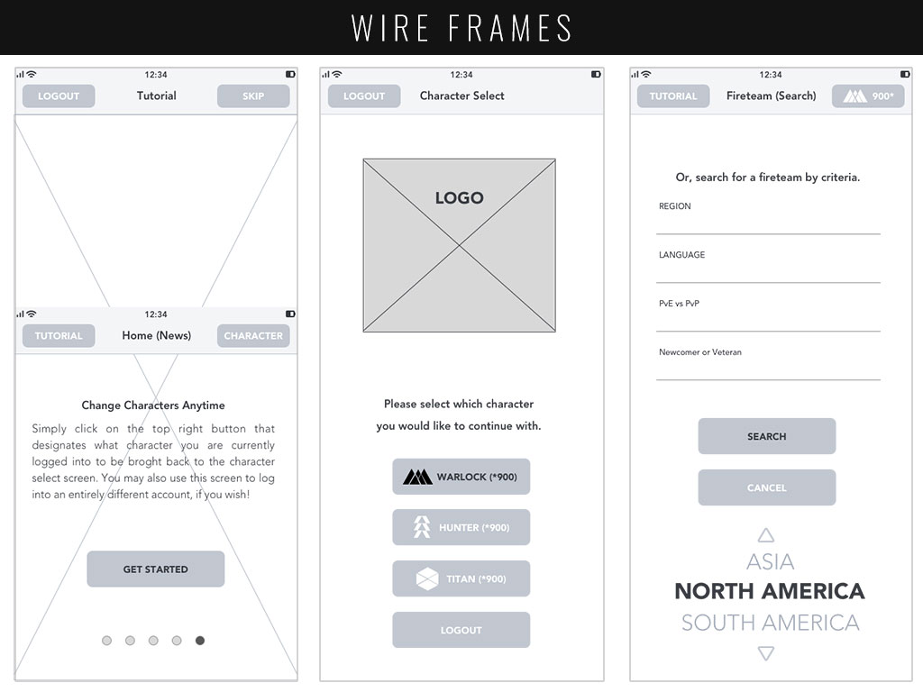
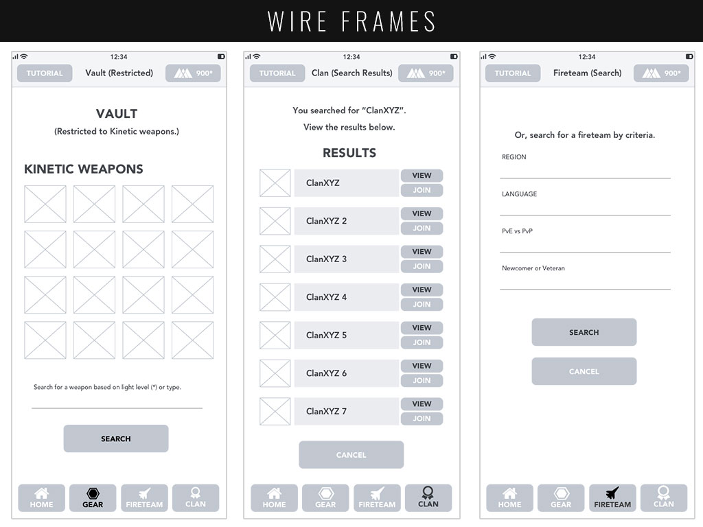
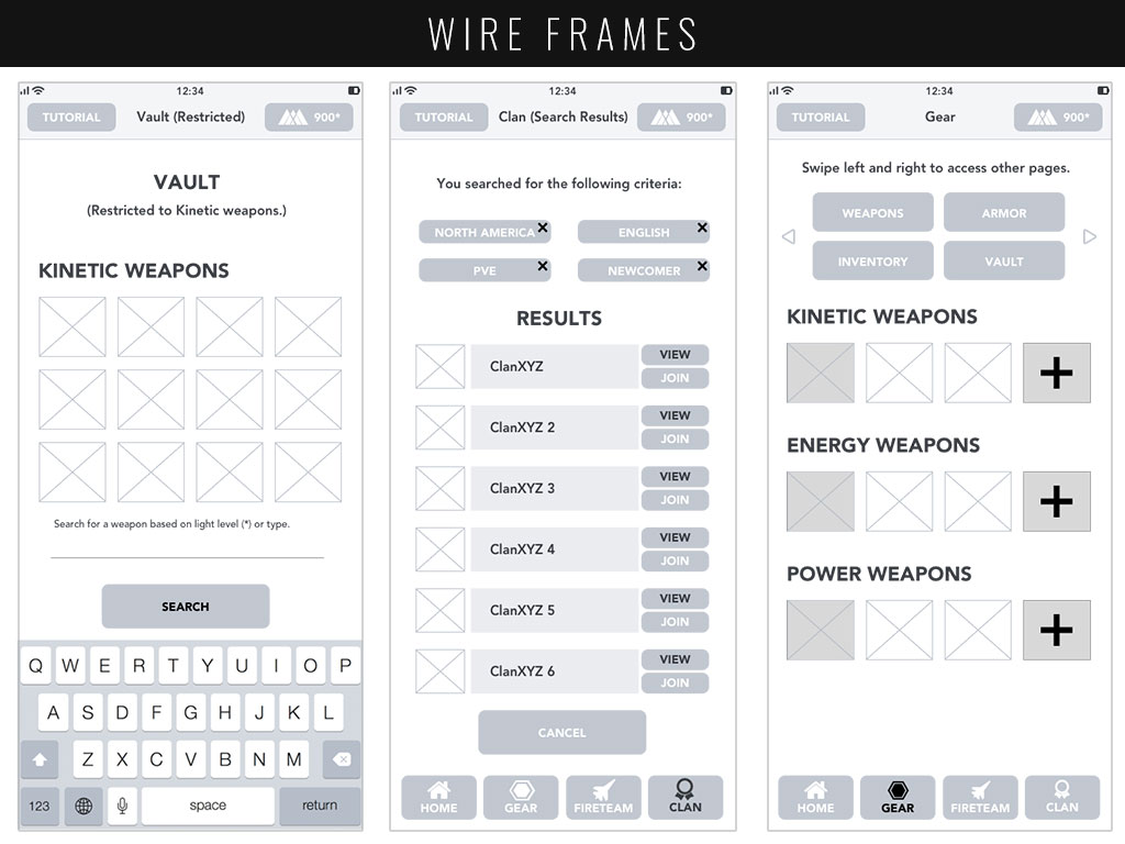
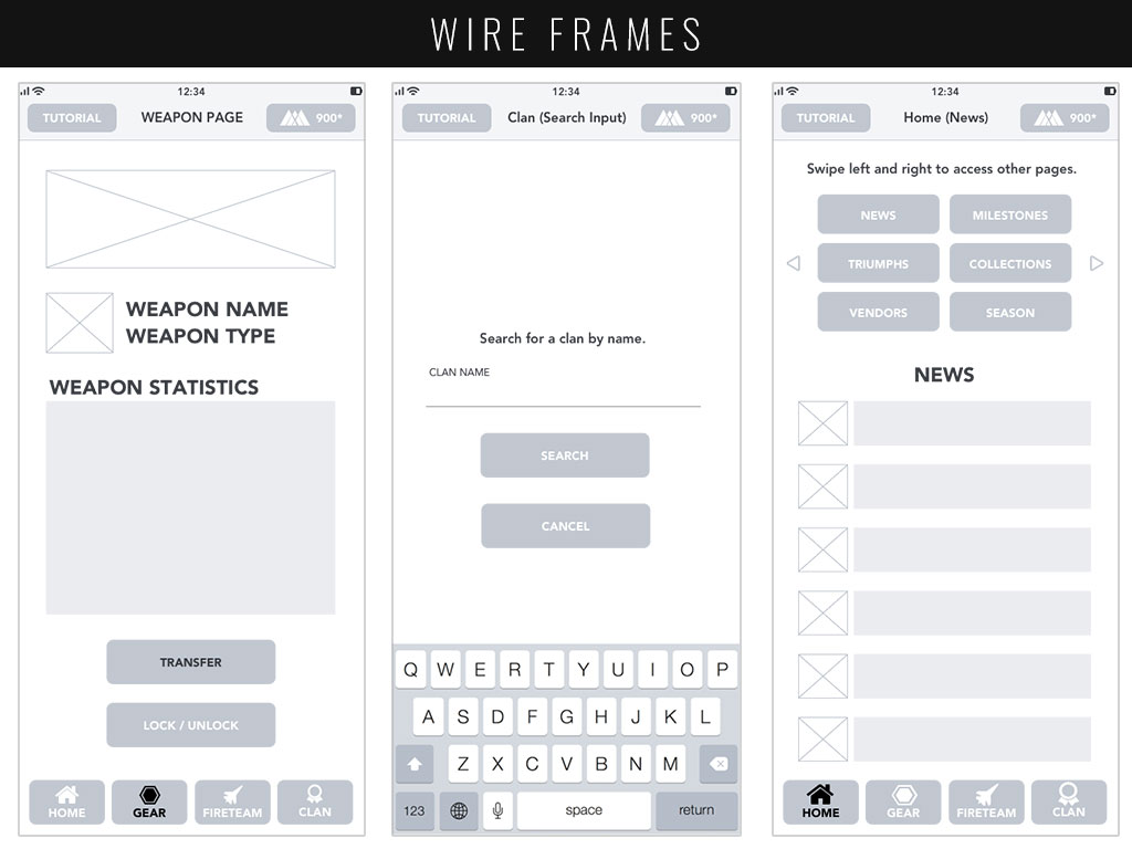
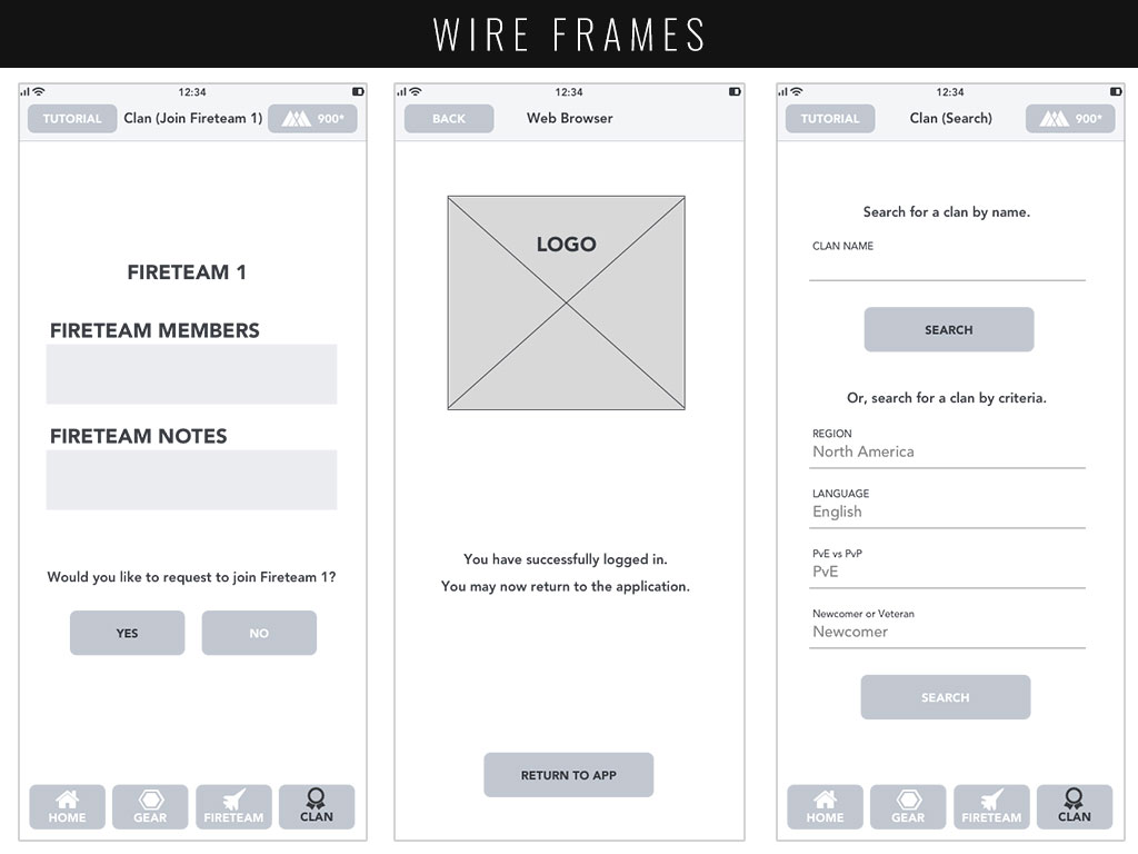
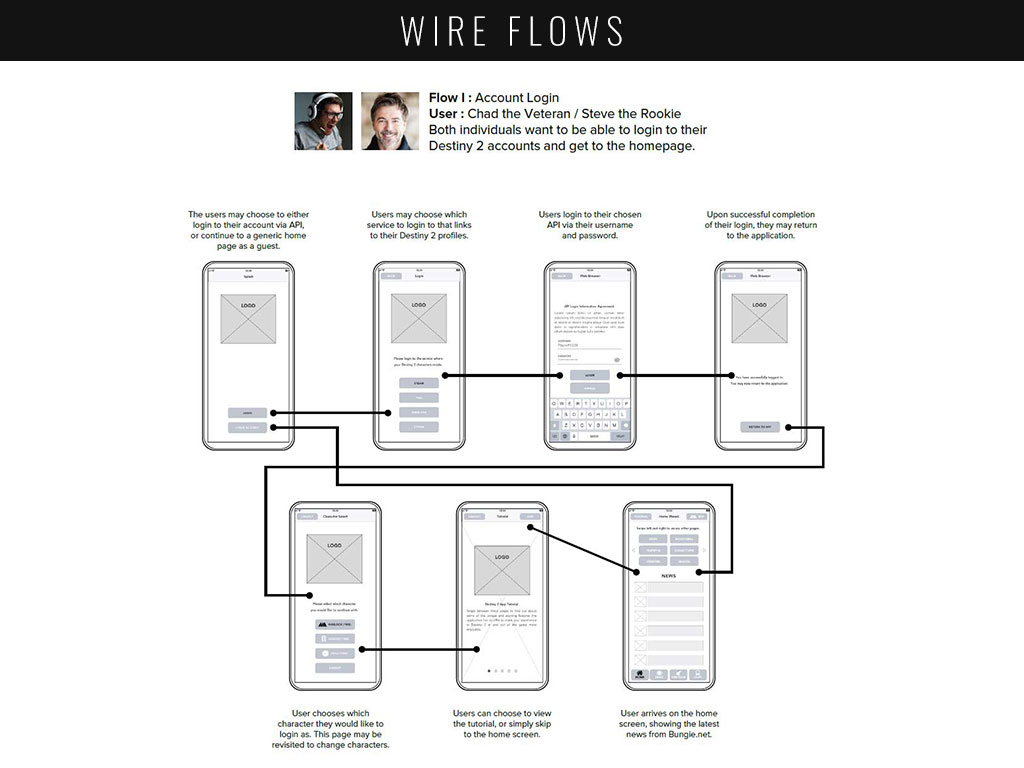
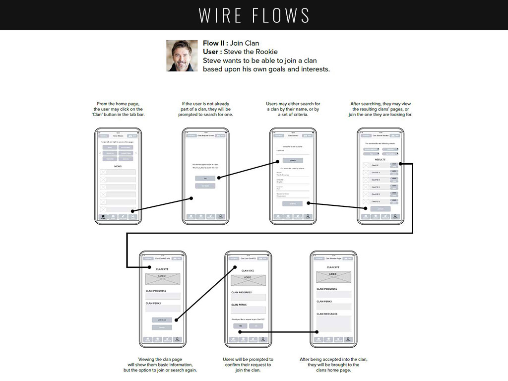
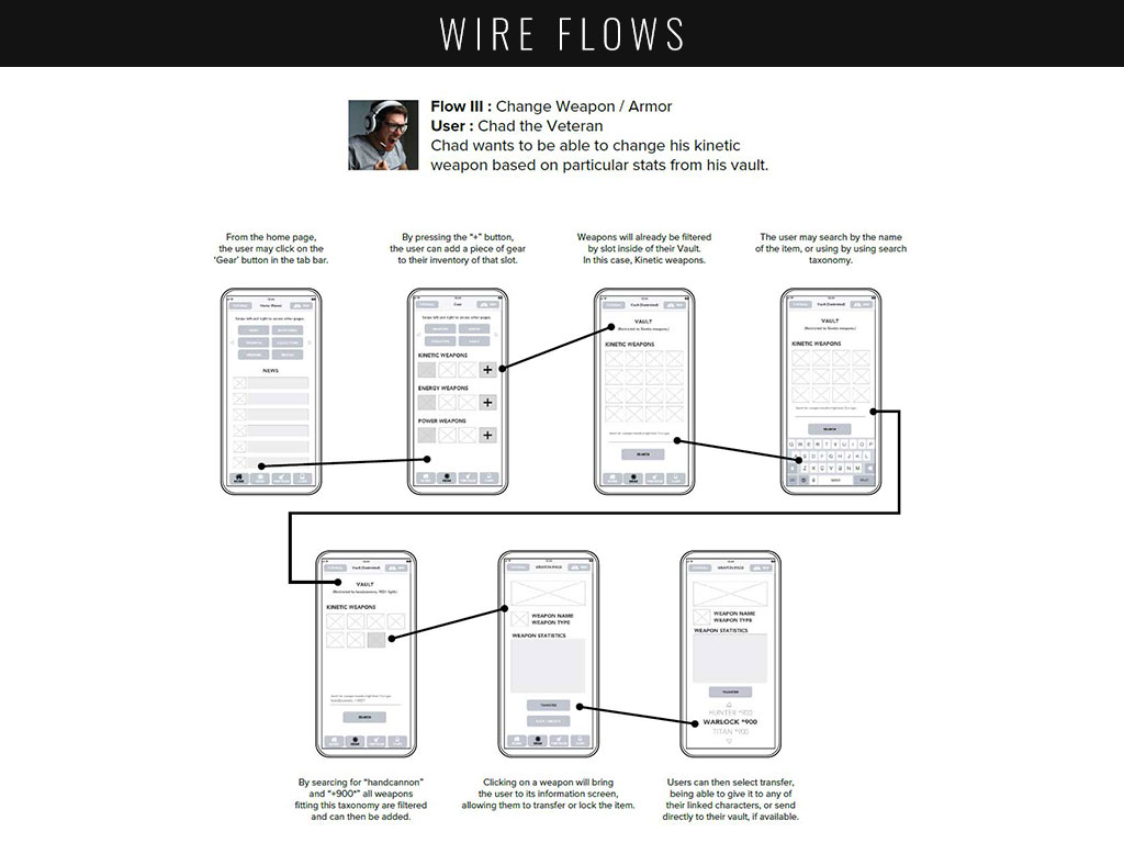
In order to test my MVP features at an early stage, I would need to create sketches of my user flows. Using these sketches, I conducted guerrilla testing in order to iron out any changes, then after some iteration and diligent note-taking, it was time to set the individual screens in stone within wire frames. With these wire frames I was then able to create wire flows to show how a user might navigate each screen to complete a task.
STYLE GUIDE & MOCKUPS
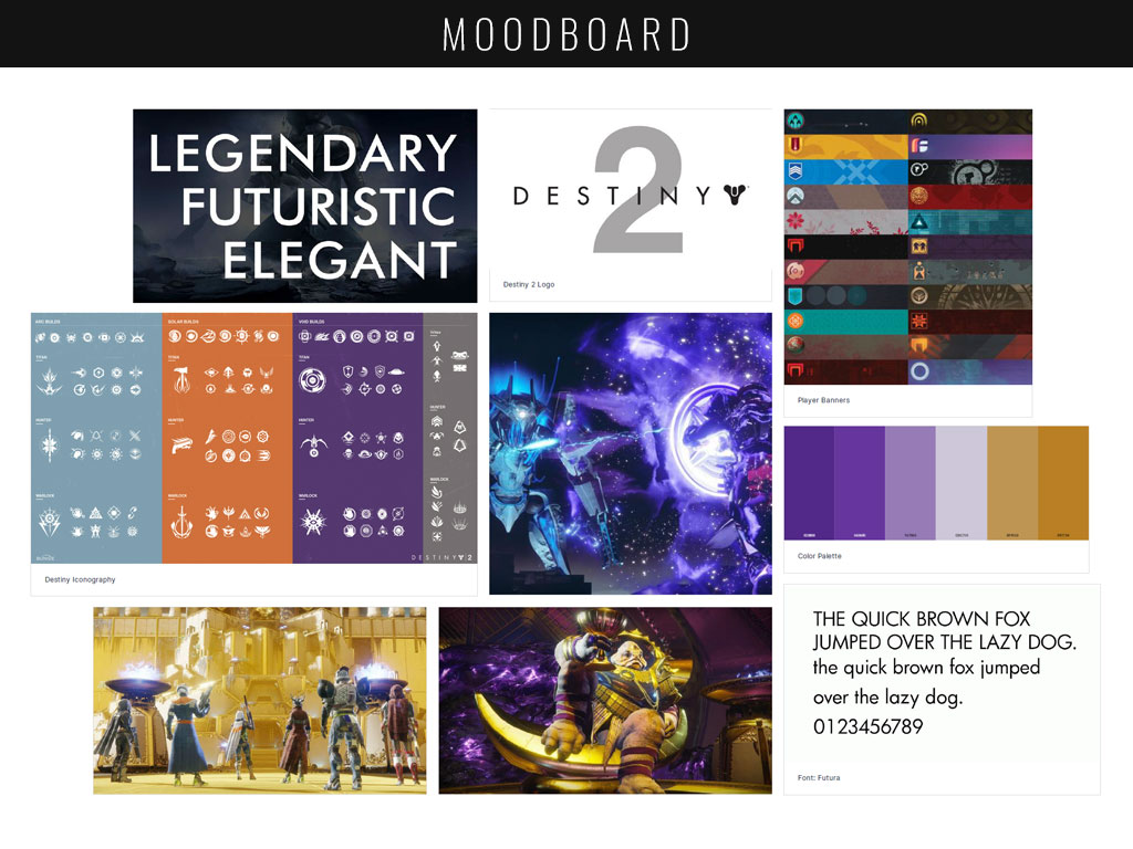
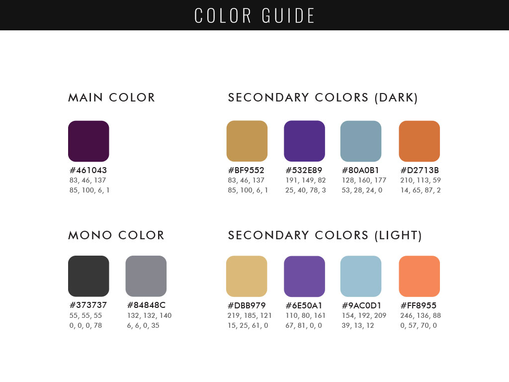
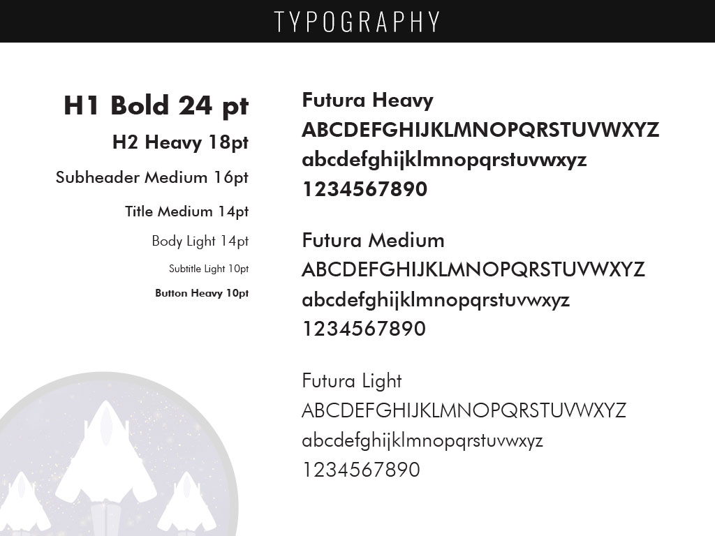
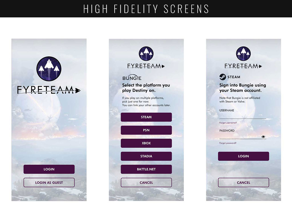
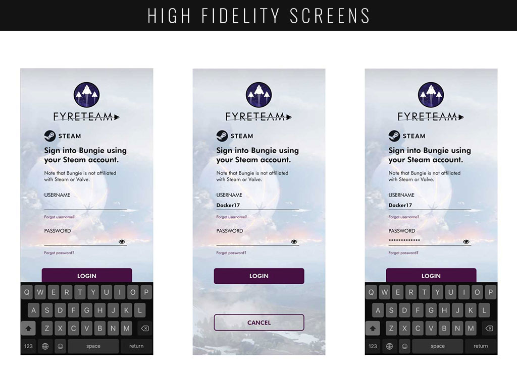
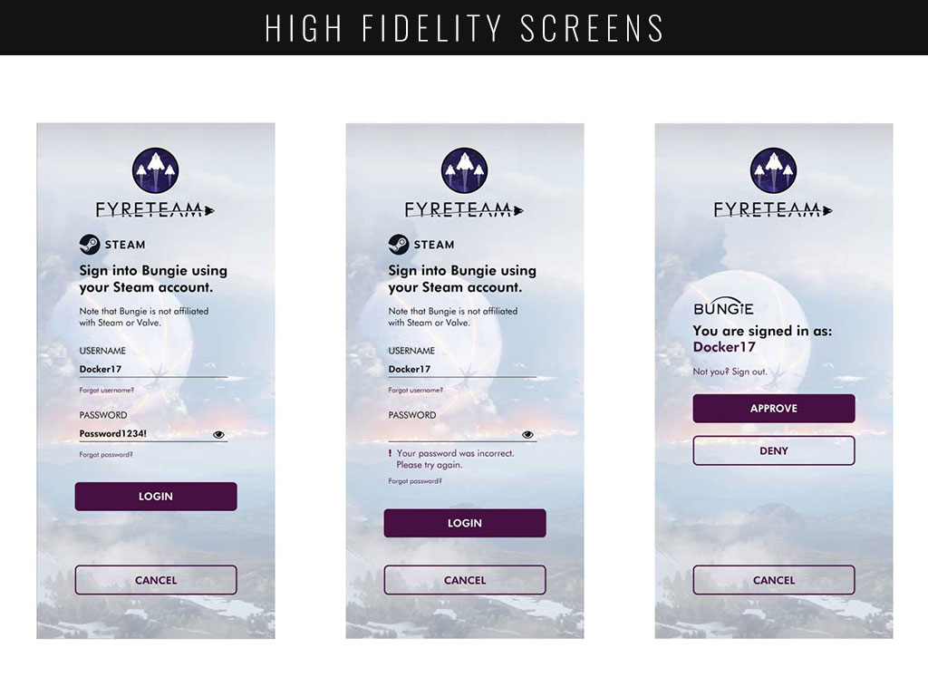
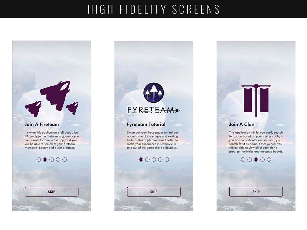
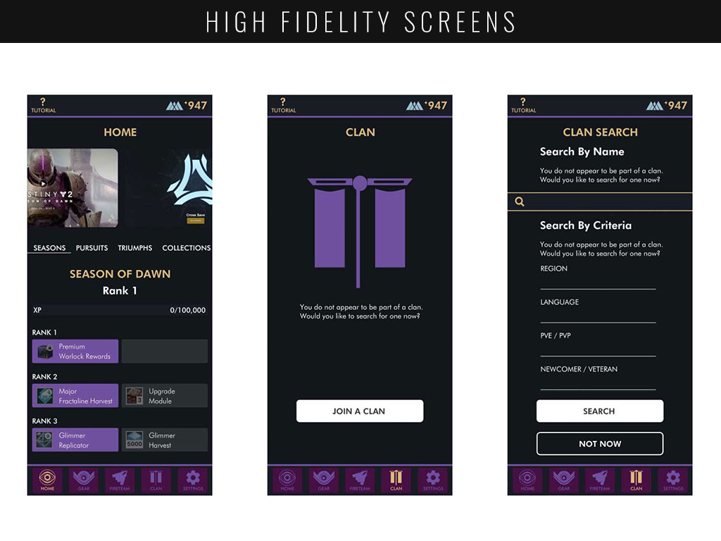
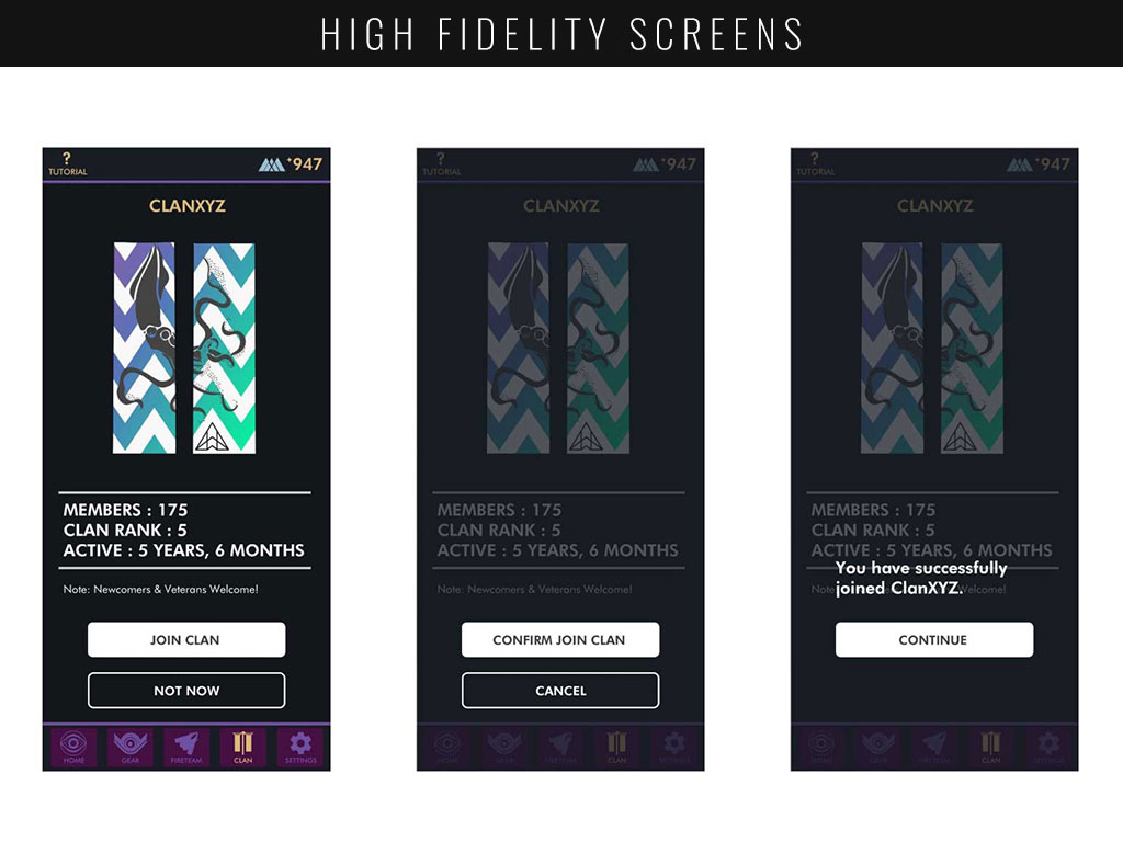
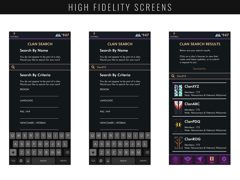
With my wireflows fleshed out, I could move into designing the application, beginning with a moodboard. The moodboard gave way to the aesthetic of my application, allowing me to create a unified look within my style guide. In turn, the style guide allowed me to place my designs within my wire frames to create high fidelity screen mockups.
PROTOTYPE
As the screens had already been built in Sketch, all that was left was to bring the application to life utilizing InVision to build a prototype. This interaction design process involved importing each screen and ensuring that they had ‘hotspot’ functionality to bring the user to the next step in the process when using the prototype.
USABILITY & ITERATION
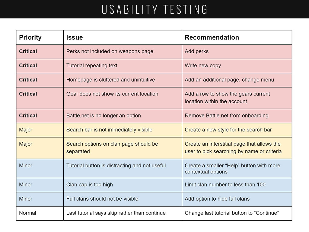
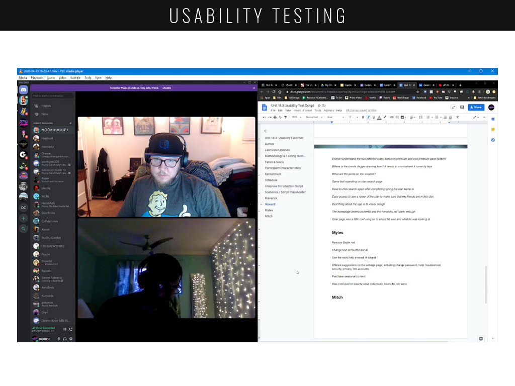
Upon the completion of my first prototype, I interviewed four individuals that had originally participated in my Google survey. Their feedback allowed me to iterate on my design, pointing out critical functionality that needed to be fixed as well as smaller suggestions that would help make the application more intuitive.
FINAL THOUGHTS
Dr. Donald Norman, a cognitive science researcher was the first to explain the importance of user-centered design. He said that design decisions should be based on the needs and wants of users. The value system of user-centered design contains: empathy, optimism, iteration, creative confidence, belief in making, embracing ambiguity, learning from failure.
Throughout nearly every step in this project, I had to stop, pause and reflect on how the decisions I just made are going to affect the end-user. I had to develop a true sense of empathy and understanding with my users in order to deliver the best possible product for them. In many ways, my learning came more from the unexpected mistakes which ended up being far more valuable than any successes they may have brought.


