DATAVIZIONER
WEB APP UI REDESIGN
Summary
Re-create UI and visuals for a web app based on user research.
Duration
1 Month.
Team
Solo, with input from the DataVizioner Team.
Tools
Google Docs, Google Slides, Sketch, Adobe Illustrator, Adobe Photoshop
Client
Deliverables
THE PROBLEM
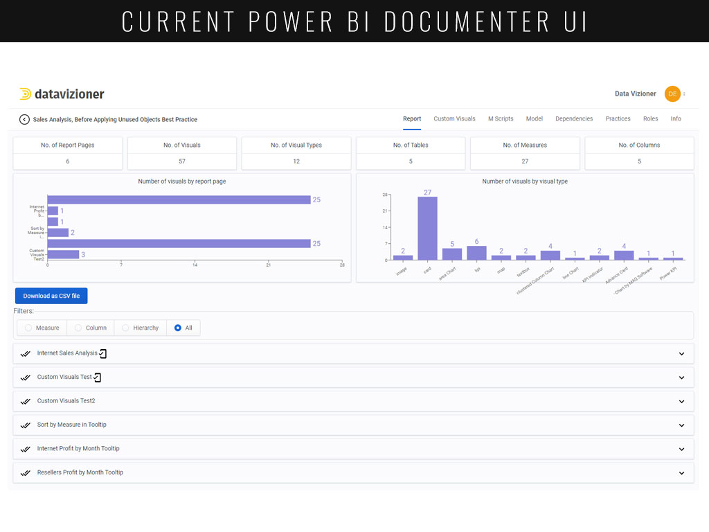
DataVizioner is a start-up tech company based out of Wellington, New Zealand. I was tasked to provide UX work revolving around their flagship product, Power BI Documenter. DataVizioner pointed out that, though they had been successful with their subscription-based model and were steadily signing on new users, like all SaaS startups they needed to improve user retention and reduce churn occurring in the first couple weeks – and improving the user experience was a key aspect of this.
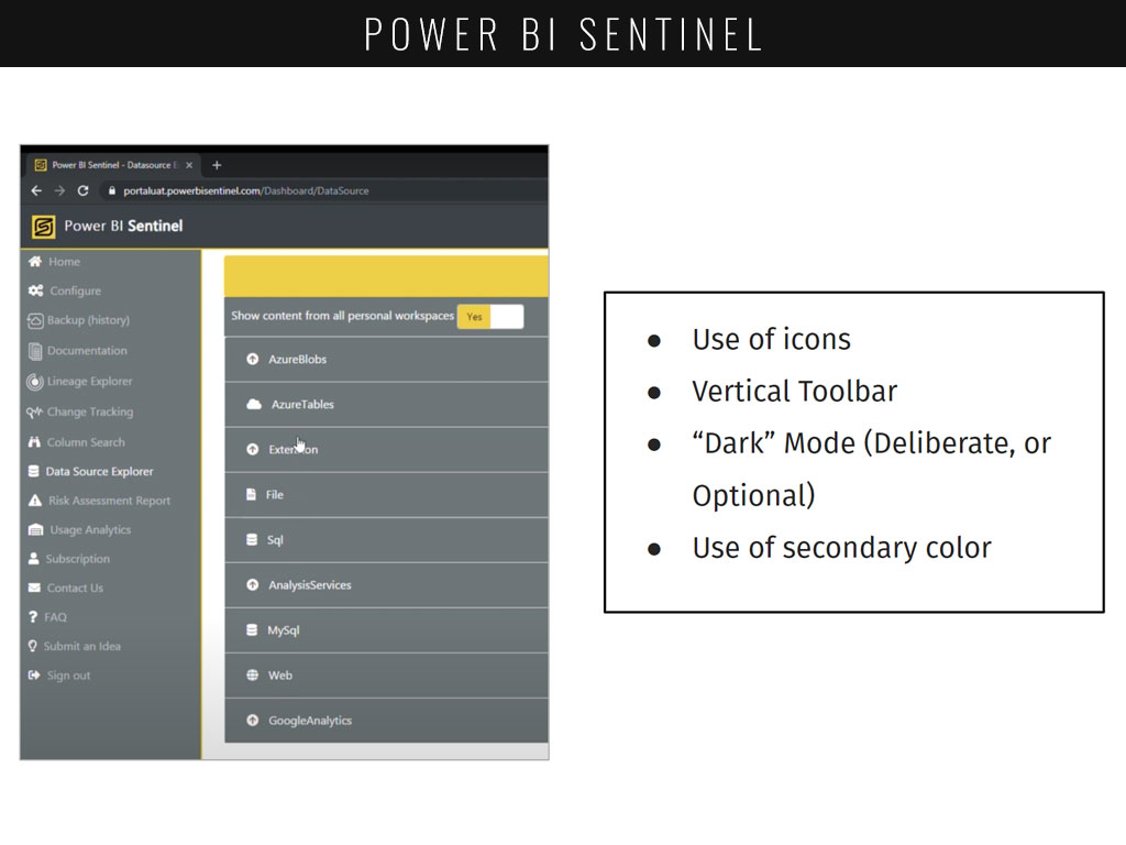
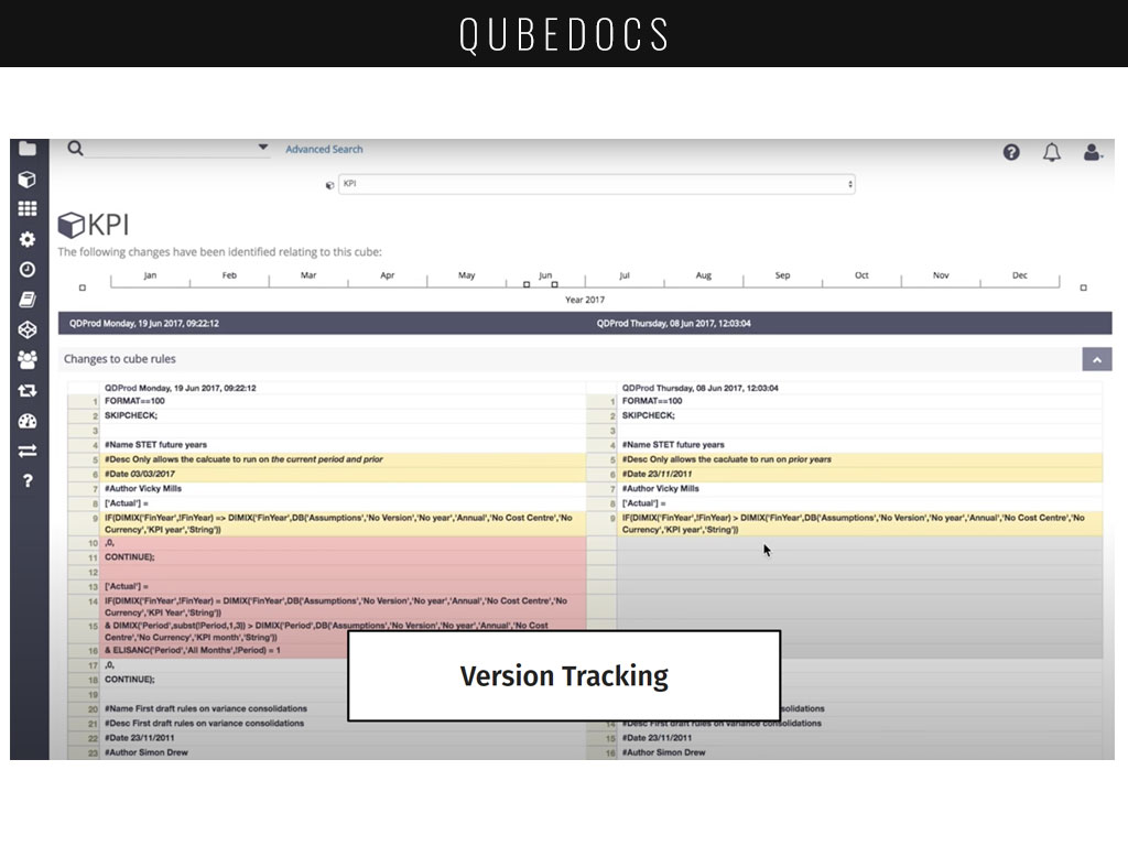
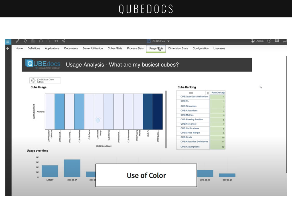
COMPETITIVE ANALYSIS
The first step in my research was to find out more about Power BI itself, as well as other competitive products that DataVizioner was up against. I was new to the Business Intelligence workspace, and needed to become acclimated to the missing features and gaps in this space. I was asked to provide an overview of a couple key features of other players in the market.

User Interviews
Following my competitive analysis, I was ready to begin conducting interviews. Users were picked from individuals who had already made submissions to a survey within the application, asking if they would be willing to participate. With additional support from DataVizioner, I assisted in conducting usability tests and asking open format questions to let users tell their story about why and how they use Power BI Documenter.
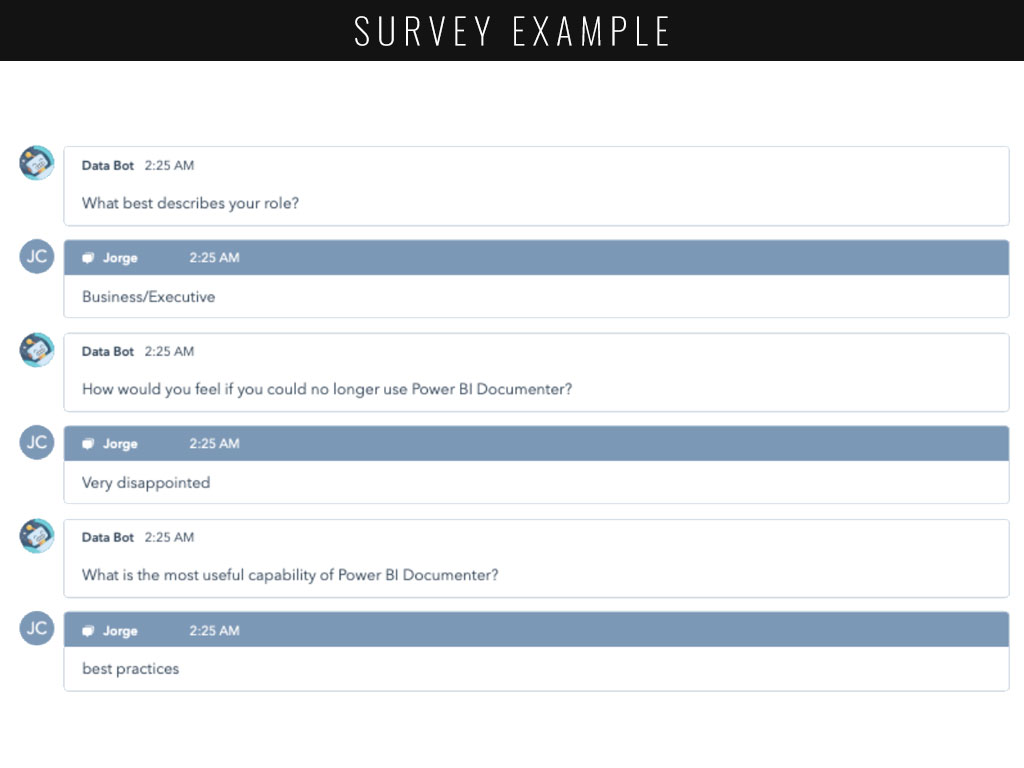
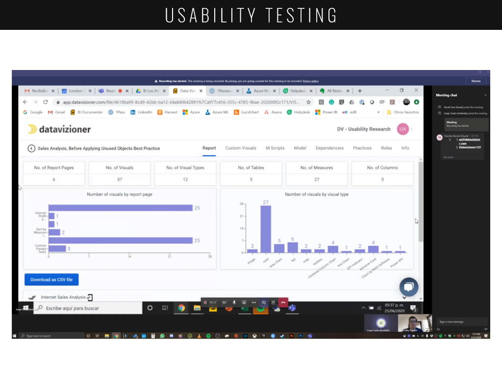
The interviews conducted after the usability test proved immensely valuable, showing just exactly where the users pain points were, the features they thought could be improved, as well as what they expected from the application.
“User documentation isn’t that difficult, it’s more about the ‘what’s changed?’ and ‘where are the gaps?’ that’s the key bit.”
“I was hoping that I could connect to a workspace and then extract all of the reports and datasets.”
“How feasible is this for a user that has 1500 files?”
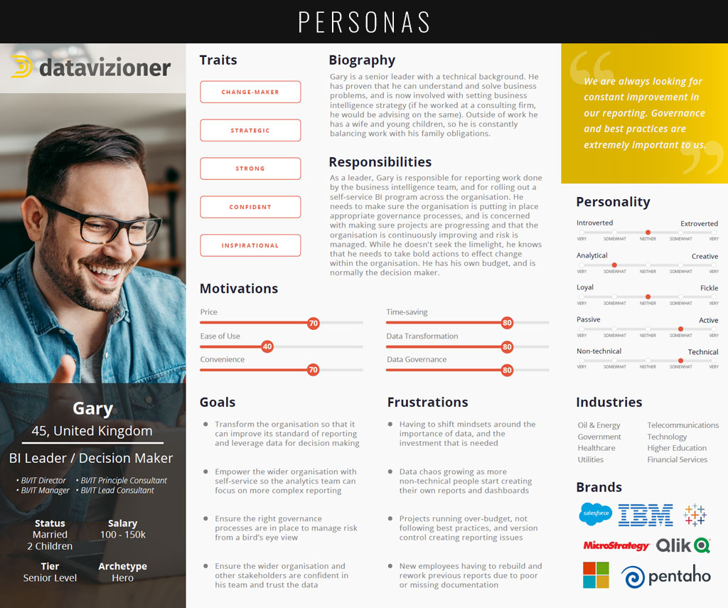
PERSONAS
A key deliverable that I was asked to provide for DataVizioner were crafted personas of their users. They wanted to ensure their product was useful for three different types of people: those who were extremely technical, those with some technical knowledge and those with none. Due to privacy issues, I can only display one here.


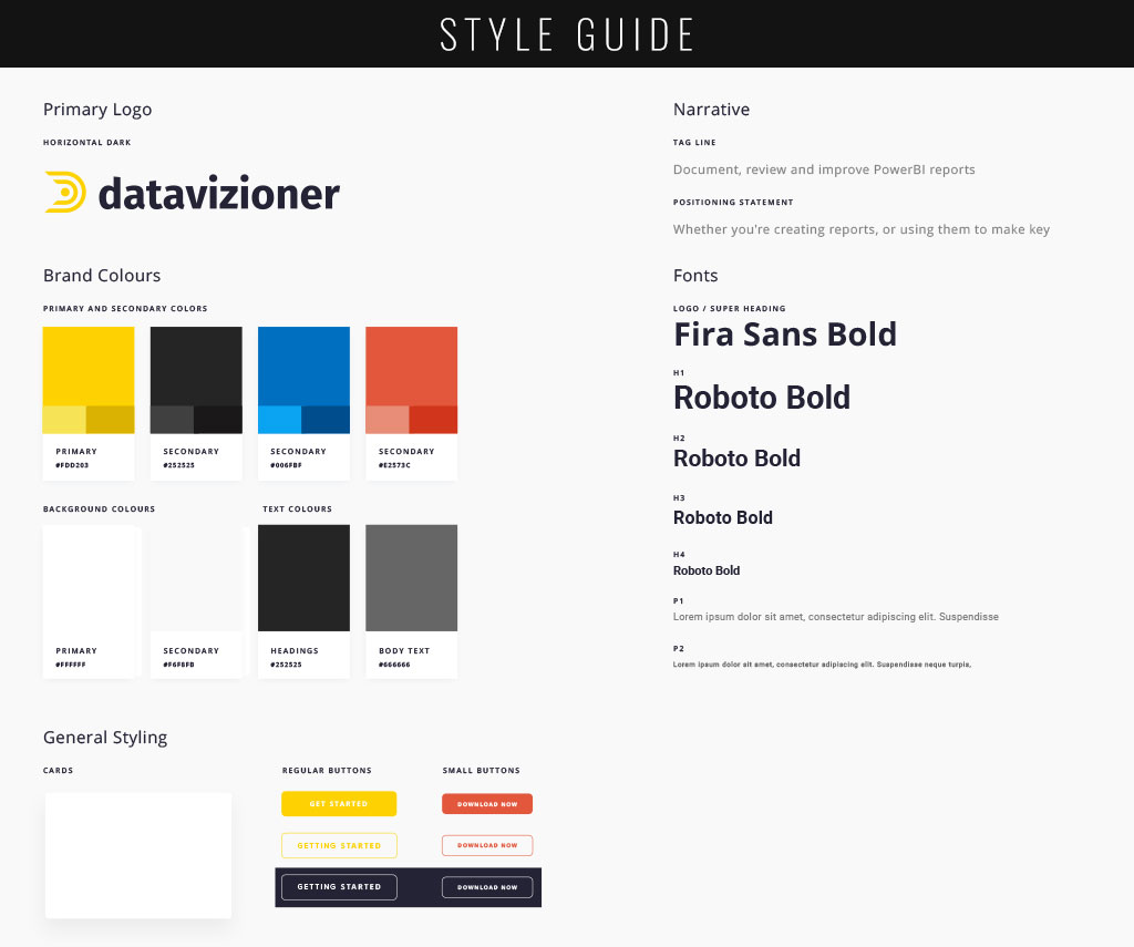
STYLE GUIDE
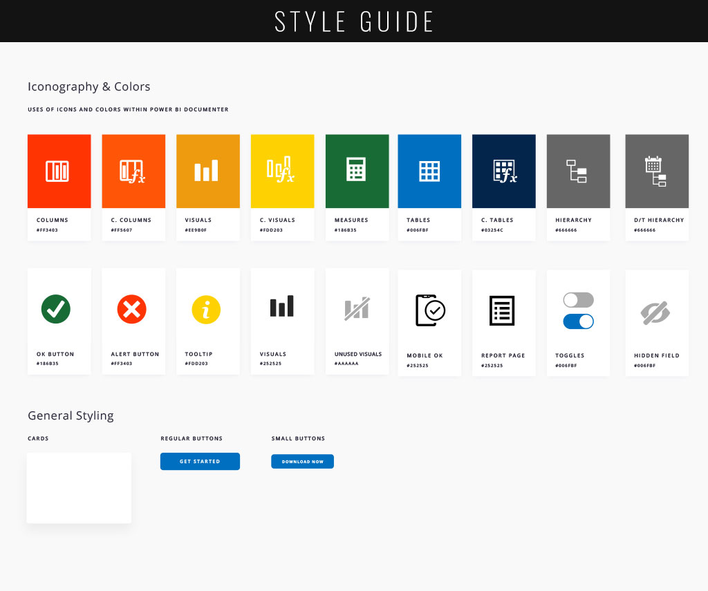
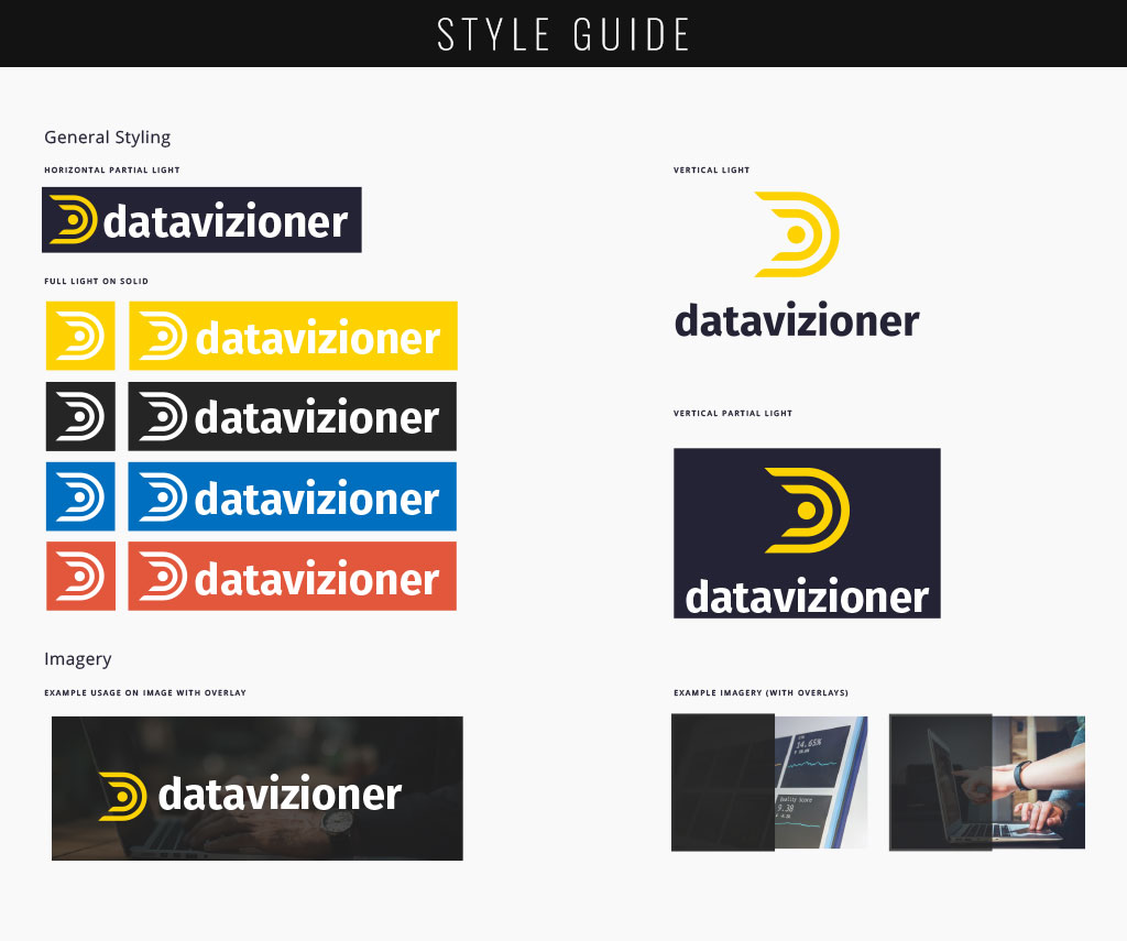
Now that I had personas to work with and consider, I was able to user the notes I took during my usability testing and interviews to create practical and valuable changes to the application’s UI. Many users had difficulty discerning differences in iconography and color, and many of the app’s screens needed spacing and tooltips that would lend to intuition. I created a style guide that the developer at DataVizioner would then be able to translate directly into the application.
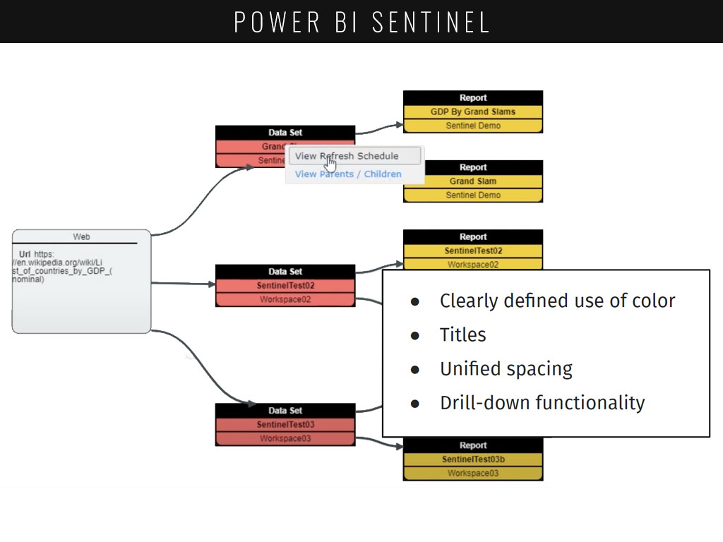
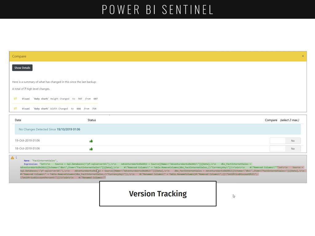
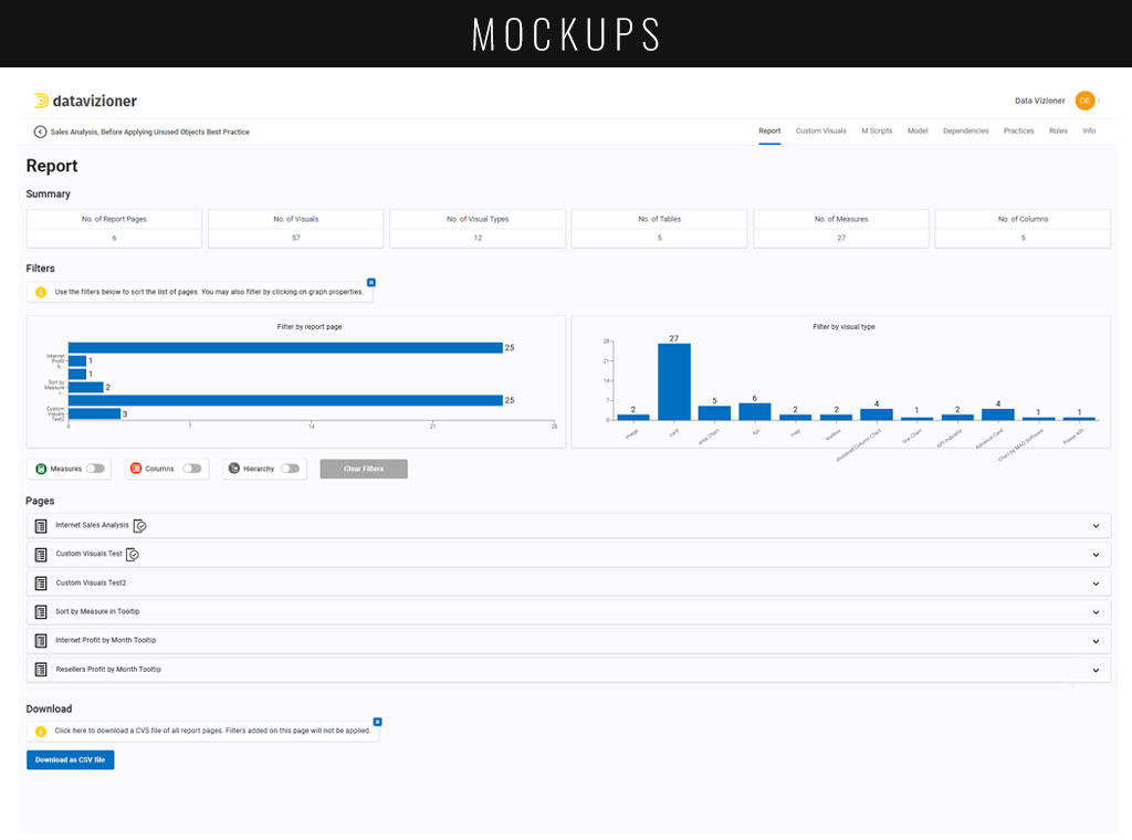
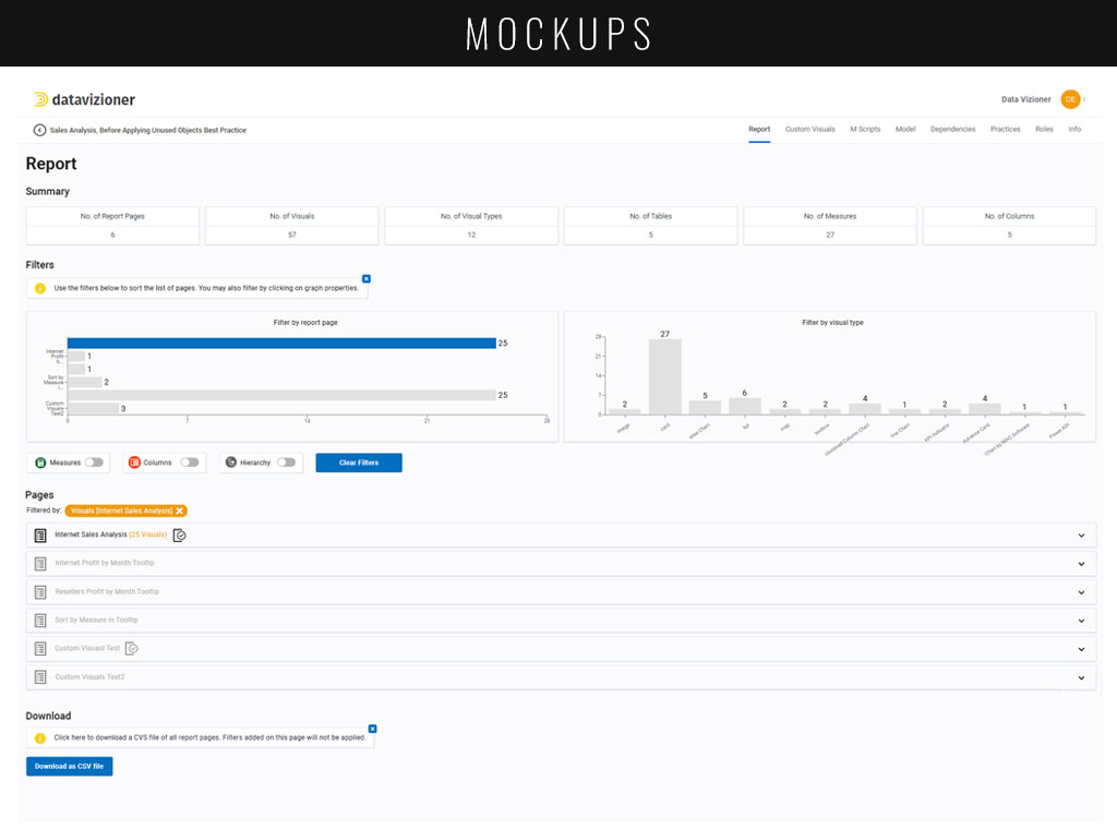
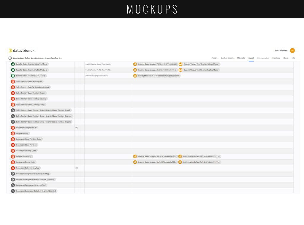
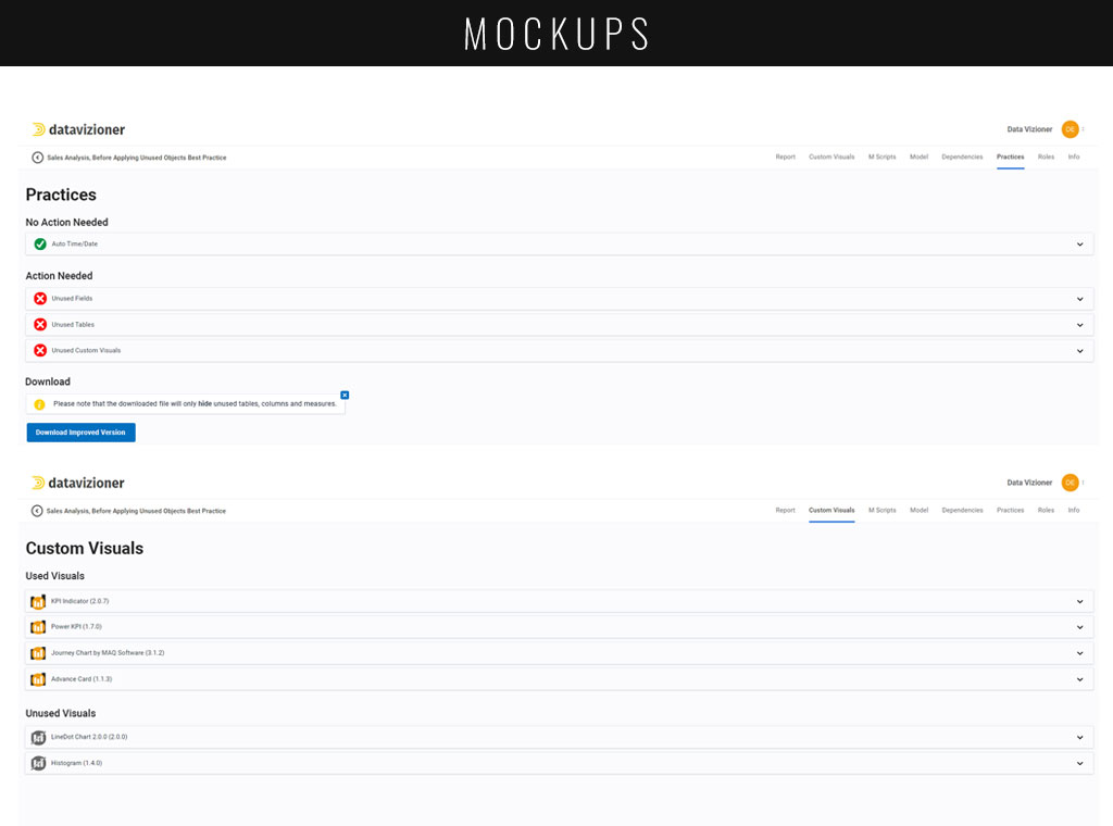
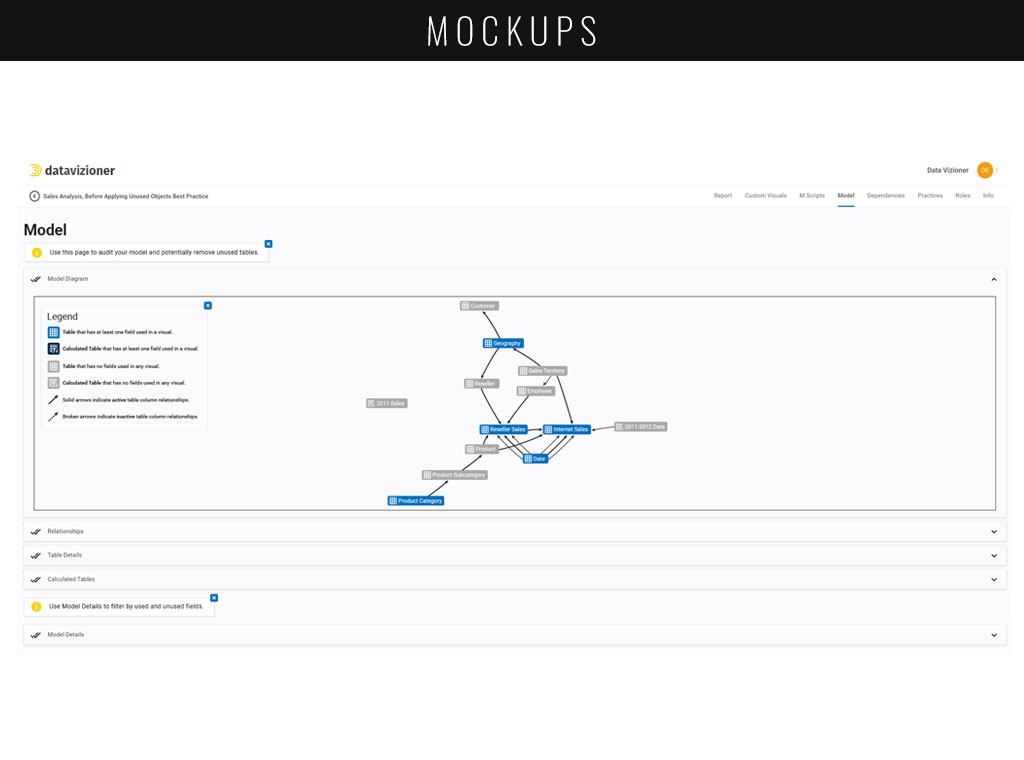
MOCKUPS
As a final step before handing my process off to development, I created mockups of key screens with my style guide implemented. This process also allowed me to give a clear insight to the team about what their application would look like. I took the time during my presentation of these mockups to explain how and why each change was necessary, based on my previous user research.


FINAL THOUGHTS
Though this particular project did not have me complete the entirety of a typical UX process, it was a learning experience to find out just how I could fit into an already established company’s creative process, and figure out exactly what I could bring to the table. Though their scope was a little more limited than what we may find in a ground-up UX case, I was able to showcase the need for change within their user interface and explain exactly how it would be helpful for them in their struggle to gain more retention with their paid users.
Through providing DataVizioner with high fidelity mockups and a comprehensive style guide, I have set the stage to help make their product more intuitive and easier to use for their customer base. By providing clear lines of sight to impactful features, creating a larger diversity in their iconography and use of color, and highlighting the most practical and useful tools, users can begin to take hold of Power BI Documenter’s most lauded feature sets and see the return in their company by creating powerful governance and security measures.
OTHER WORK
Check out some of my other adventures.